In Chapter 2 we summarized data numerically, which allowed us to gather basic information about the data. In this chapter, we will summarize data visually, which is another critical step in getting to know the data we are working with.
Choose appropriate plots for different types of variables
Construct visualizations using ggplot()
Interpret visualizations
Visualizations can be useful for exploring and understanding data, looking at the overall patterns and trends, describing the distribution of data, helping raise new questions or hint that you’re asking the wrong question, and delivering a message about the data to the viewer.
The exploratory stage of data visualization is often done for ourselves, our research team, and colleagues. We will do exploratory data visualization in this chapter, and learn to write code that will give us basic visualizations. When our aim is to deliver a message, we must go beyond the basics to communicate it effectively. We will cover how to improve our basic plots in more detail in Chapter 4.
3.1 Data Context
Throughout this chapter, we’ll be working with the American Time Use Survey (ATUS) data. The United States Bureau of Labor Statistics conducts this survey annually to measure how Americans spend their time on various activities, including work, household activities, caregiving, and leisure pursuits.
We have included some of the ATUS data, including responses only from those who are enrolled in a college or university in the atus_college data frame. This dataset provides insights into how college students spend their time, including employment status, enrollment status, weekly earnings, and time spent alone.
We can go ahead and load the packages we will use in this chapter. The atus_college data is provided in the {hellodatascience} package. The data visualization functions that we will use mostly come from the {ggplot2} package. The {ggplot2} package loads along with other tidyverse packages when library(tidyverse) is called.
library(hellodatascience)library(tidyverse)
── Attaching core tidyverse packages ──────────────────────── tidyverse 2.0.0 ──
✔ dplyr     1.2.1     ✔ readr     2.2.0
✔ forcats   1.0.1     ✔ stringr   1.6.0
✔ ggplot2   4.0.3     ✔ tibble    3.3.1
✔ lubridate 1.9.5     ✔ tidyr     1.3.2
✔ purrr     1.2.2
── Conflicts ────────────────────────────────────────── tidyverse_conflicts() ──
✖ dplyr::filter() masks stats::filter()
✖ dplyr::lag()    masks stats::lag()
ℹ Use the conflicted package (<http://conflicted.r-lib.org/>) to force all conflicts to become errors
We can go ahead and load the data and glimpse at it.
Recall that the following code needs to be run in the Console to get the documentation for the dataset.
?atus_college
The atus_college dataset has 312 rows and 13 columns. In other words, this dataset has information on 13 variables from 312 college students. Note that there are more than 312 students in the United States, hence the visualizations we will make in this chapter will be about these specific individuals. Once we get to ?sec-probability and beyond, we will discuss whether we can extend our findings to the overall student body in the United States. The variables represented in each column of the data are shown in Table 3.1.
Table 3.1: Documentation of Variables in the atus_college data
Variable Name
Description
employment
full time or part time employment status of respondent
age
age
enrollment
are you enrolled as a full-time or part-time student?
weekly_earnings
weekly earnings at main job
household_size
number of people living in respondent’s household
time_alone
total nonwork-related time respondent spent alone (in minutes)
sleep_time
time spent sleeping
work_time
time spent working at main job
degree_class_time
time spent taking class for degree, certification, or licensure
shopping_time
time spent shopping (store, telephone, internet)
lunch_break_time
time spent taking a lunch break
sports_time
time spent participating in sports, exercise, or recreation
religious_time
time spent attending or participating in religious services
3.2 Visualizing a Single Variable
Before we dive into advanced analyses, it is essential to understand the variables in our dataset one at a time. Single-variable visualizations help us explore the distribution, central tendencies (e.g., mean and median), and patterns within each variable. This preliminary step informs our understanding of the data and guides subsequent analyses. There are a variety of plots that we can create, but the choice of plot is often determined by the type of variable we have.
3.2.1 Visualizing a Categorical Variable
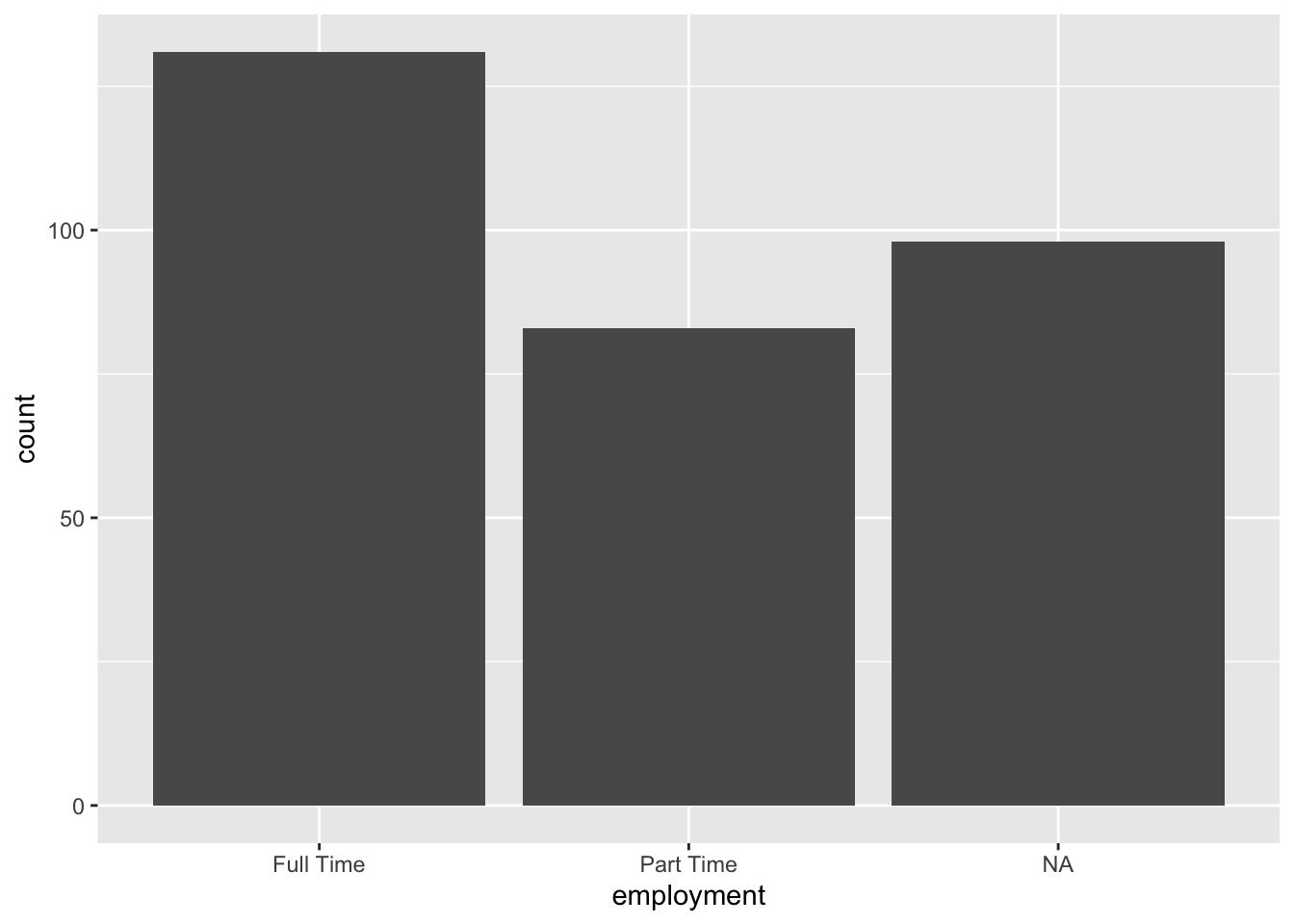
A bar plot (also called a bar chart) can be used to visualize a categorical variable. Recall that in Section 2.4.1 we had said that we can summarize categorical variables with counts and proportions. Bar plots display counts and proportions using rectangular bars, where the height of each bar corresponds to the proportion or the number of observations in that category.
Figure 3.1: A bar plot of employment status
The bar plot in Figure 3.1 displays the distribution of employment status among college students, helping us compare the number of students who work full-time, or part-time. As we can see, more students work full-time than part-time You might also notice that there are some missing values as denoted by NA. In fact there are more observations that are NA than part-time. You might be wondering what these NA values represent. Could they be the ones who are unemployed? Or could they be those who just did not want to respond to this particular survey question? Well, we don’t know. Understanding missing data may require additional analyses.
We can use a bar plot when
we have categorical data
we want to compare frequencies across different categories
we want to identify the most and least common categories
Let’s go ahead and replicate Figure 3.1 using R. To create all of our plots, we will be using the ggplot() function, which creates a coordinate system that you can add layers to, such as type of graph, labels, color, and much more. Most of the basic plots we will make in this chapter will consist of three steps:
In the first step, using the ggplot() function, we specify the data we will use. This code will create a blank canvas with a gray background.
ggplot(data = atus_college)
Figure 3.2: Blank coordinate system
The next step is the mapping. Within the ggplot() function we use the aes() function to map variables to certain aesthetics. In this case of creating a barplot for employment, we are only mapping the employment variable to the x-axis. After this code, you will notice that the categories of the employment variable are now shown on the x-axis.
ggplot(data = atus_college, aes(x = employment))
Figure 3.3: Mapping employment variable to the x-axis
The final step is to add a geometric object (geom_bar()) that tells ggplot how to display the data (with bars). Note that a geometric object adds a layer to our plot, hence it is added by using a + sign in the previous line.
It is clear that aes() is an argument within the ggplot() function since data and aes() are vertically aligned. When our aesthetic mappings get long we will prefer this method of specifying arguments in a vertical manner.
3.2.2 Visualizing a Numeric Variable
There are many different plots that can be utilized to visualize a numeric variable. In this section, we will cover histograms and boxplots. You should be aware that there are many other options.
A histogram is one of the most fundamental tools for exploring numeric data. It displays the distribution of a numeric variable by dividing the range of the variable into bins (intervals or classes) and showing the frequency of observations in each bin.
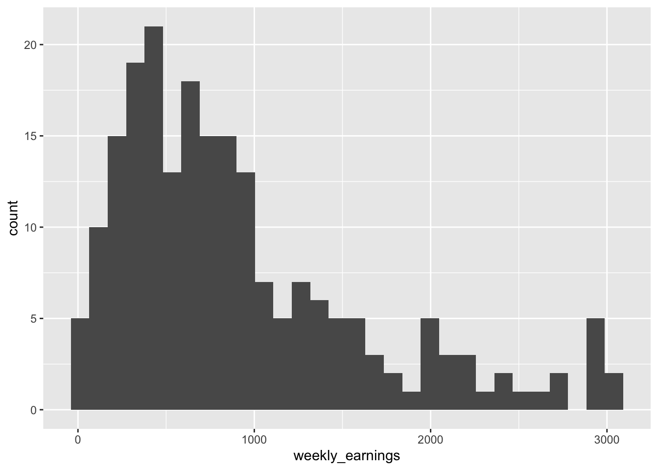
We will visualize the weekly_earnings variable using a histogram. To create a histogram, we will use the three-step process that we learned while making a bar plot.
We specify the data within the ggplot() function. i.e., ggplot(data = atus_college)
2
We map our variables to aesthetics. In this case, we would like to display the weekly_earnings on the x-axis. i.e., aes(x = weekly_earning)
3
We state the plot type by using the appropriate geom object. i.e., geom_histogram()
`stat_bin()` using `bins = 30`. Pick better value `binwidth`.
Figure 3.5: A histogram of weekly earnings
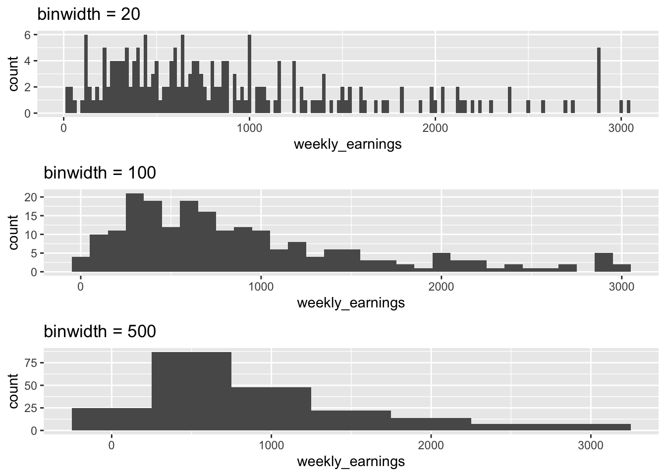
The weekly earnings data range from about $0 to $3,000 and there are 30 bins, so each bin has a width of about $100. Reading the plot we can see 4 people make between $0 and $100, 10 people make between $100 and $200, and so on. We can also observe overall trends like that most of the people in the data make $1000 a week or less, with very few making above $2,000 a week.
You might also notice that, in addition to displaying the histogram, R is showing us a message right below the code. The message says, “stat_bin() using bins = 30. Pick better value with binwidth.” which is informing us that in order to make a histogram, R had to make certain decisions. By default, R made an histogram with 30 bins (the up-right rectangles) but this may not be the best choice. R is telling us to use the binwidth argument to choose a value appropriate for our data.
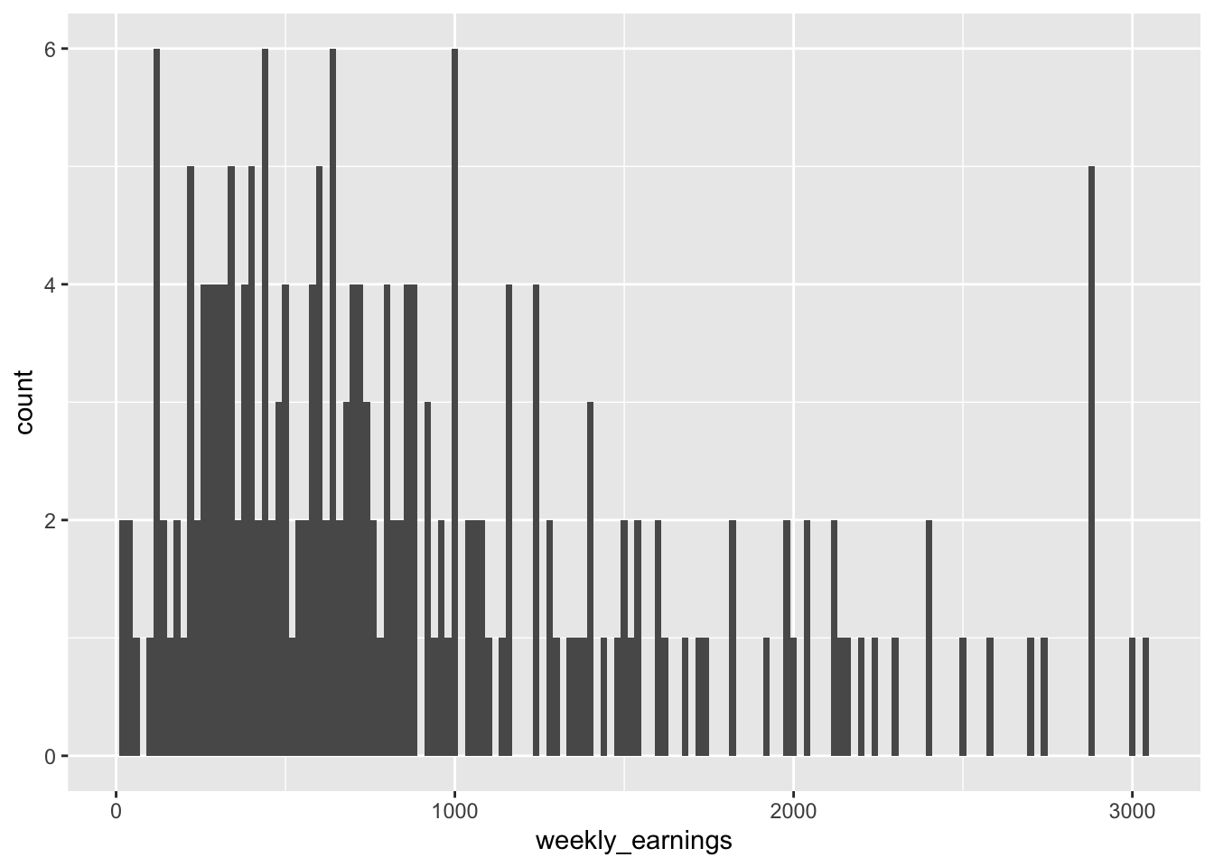
Let’s go ahead and set the width of each rectangle to $20 using the binwidth argument to see if that’s a better choice.
Since binwidth is related to the histogram layer, this argument goes inside the geom_histogram() function.
Figure 3.6: A histogram of weekly earnings with binwidt of $20
You can see that the bins got very thin when they were set to $20. There are many bins that are empty or have a height of 1, in other words, many bins represent only a single observation. Perhaps setting the binwidth to $20 was not the best decision.
Figure 3.7: Comparing different binwidths
So, how does one determine the best binwidth or number of bins? This has been a question that many statisticians have tried to answer. Some have come up with their own rules. However, these rules are above the scope of this book. At this early stage we will decide on the binwidth by trying different binwidths based on the range of our data to see what reveals patterns best, as shown in Figure 3.7. We don’t want a lot of bins as it may result in too many empty bins, and it would be hard to see the overall pattern (e.g., binwidth = 20). We also don’t want too few bins as there will be a loss of detail (e.g., binwidth = 500). We want something that is summarized but that may also display important details based on the context of our data.
In Figure 3.7, it may seem at first that the height of all the graphs is the same, but a closer look shows you that the range of the y-axis is different in the three graphs. As you explore various binwidths to determine what best describes your data, R adjusts the rectangular window to fit the data. The larger the binwidth, the fewer the number of bins with a larger frequency and hence the taller the bins. On the other hand, a smaller binwidth results in a larger number of bins with smaller frequencies and often empty ones.
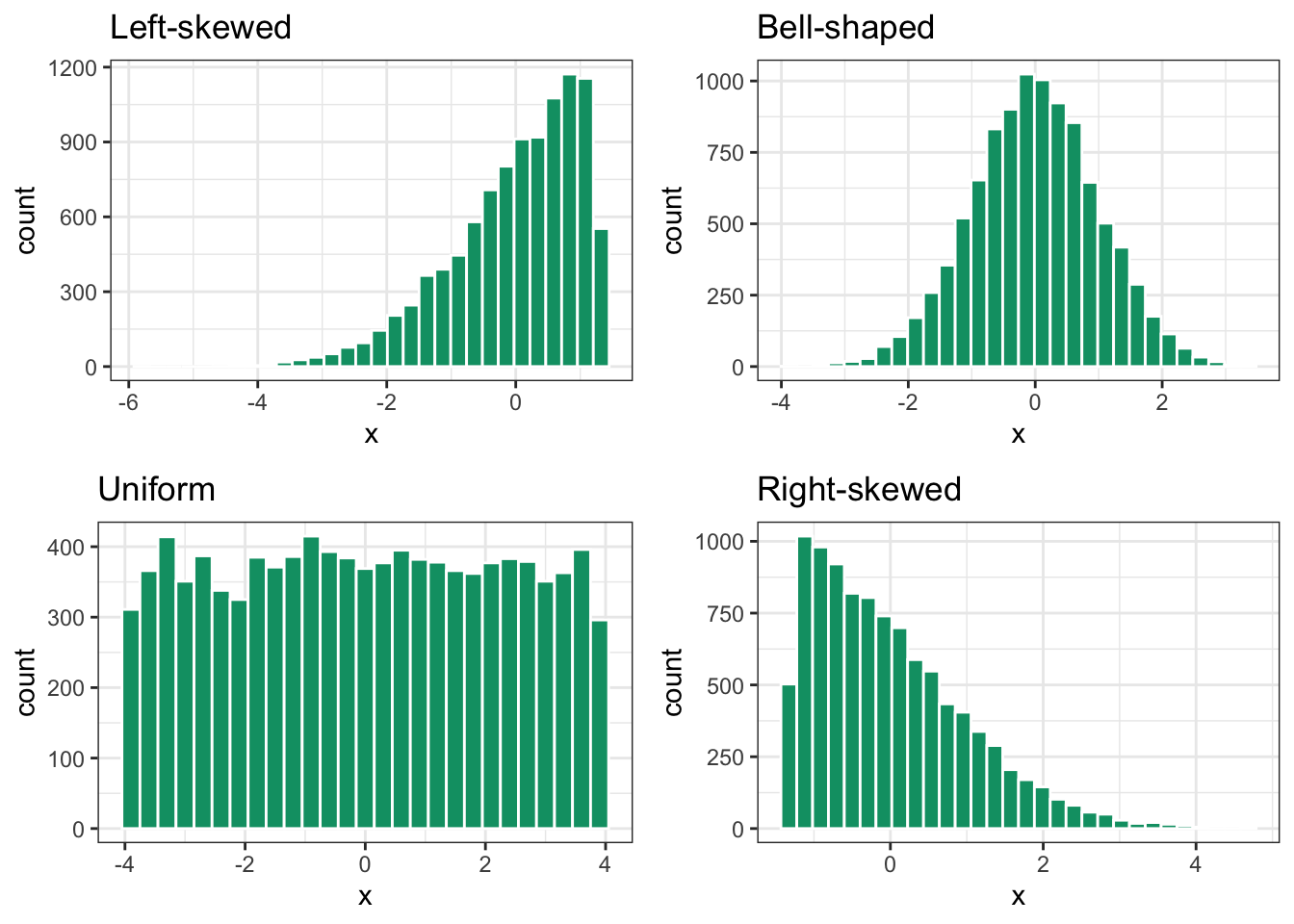
One last concept we need to understand while using histograms is skewness, which is a measure of asymmetry of a distribution. It tells us whether the data tends to have longer “tails” on one side compared to the other (i.e. unusual extreme observations relative to the rest of the data), and where the bulk of the data is concentrated.
Figure 3.8: Understanding skewness of a histogram
In Figure 3.8, we can see the four most common types of distributions. A left-skewed distribution has a long tail extending to the left, and has most of the data clustered on the right side. The tail is also in the direction of the negative side of the x-axis, and hence sometimes other data scientists refer to this as a negatively skewed distribution.
In a bell-shaped distribution, the tails on the right and left are approximately equal in length, and the data is concentrated in middle. Data is evenly distributed around the center and hence the mean and median of the data is close to one another.
In a uniform distribution all bins have the same height, and hence this distribution is associated with the shape of a rectangle. Both bell-shaped and uniform distributions are considered symmetric distributions because if you were to cut the graph in half, the left side is a mirror image of the right side. In a perfectly symmetric distribution, the mean and the median are equal.
In a right-skewed distribution, the majority of observations are concentrated toward the lower values on the left side, while a lengthy tail stretches toward the higher values on the right. The tail extends in the positive direction along the x-axis, which is why other data scientists might also call this a positively skewed distribution.
The distribution of weekly_earnings is
left-skewed
symmetric
right-skewed
Looking at the distribution of the weekly_earnings which of the following can be concluded?
mean > median
mean = median
mean < median
In general, for left-skewed distributions, the mean is smaller than the median, while the opposite happens for right-skewed distributions, where the mean is greater than the median.
Let’s wrap up on histograms by considering when we can use a histogram. When we
have numeric data
want to identify patterns like skewness or multiple peaks
want to see the central tendency and spread of the data
want to check if data follows a particular distribution (like a bell curve)
Since bar plots and histograms both have up-right rectangles, it might be easy to confuse them. One way to distinguish them is by remembering that bar plots are for categorical variables and histograms are for numeric variables. That’s why the bars in the bar plot have spaces between them but bins in a histogram are adjacent to one another as the numbers can be continuous but categories cannot.
Another plot type that can help us visualize a numeric variable is a boxplot (also called a box-and-whisker plot). It provides a visual representation of the central tendency, spread, and skewness of numeric data, by displaying the minimum, first-quartile, median, third-quartile, and maximum, also known as the five-number summary.
Let us create a boxplot of weekly_earnings. Following the three-step pattern for bar plot and histogram, we will write a similar code with a slight twist.
We specify the data within the ggplot() function. i.e., ggplot(data = atus_college)
2
We map our variables to aesthetics. In this case we would like to display the weekly_earnings on the y-axis. i.e., aes(y = weekly_earnings). We actually do not want any variable on the x axis, so we do not specify any for it.
3
Lastly, we specify the plot type by using the appropriate geom object. i.e., geom_boxplot().
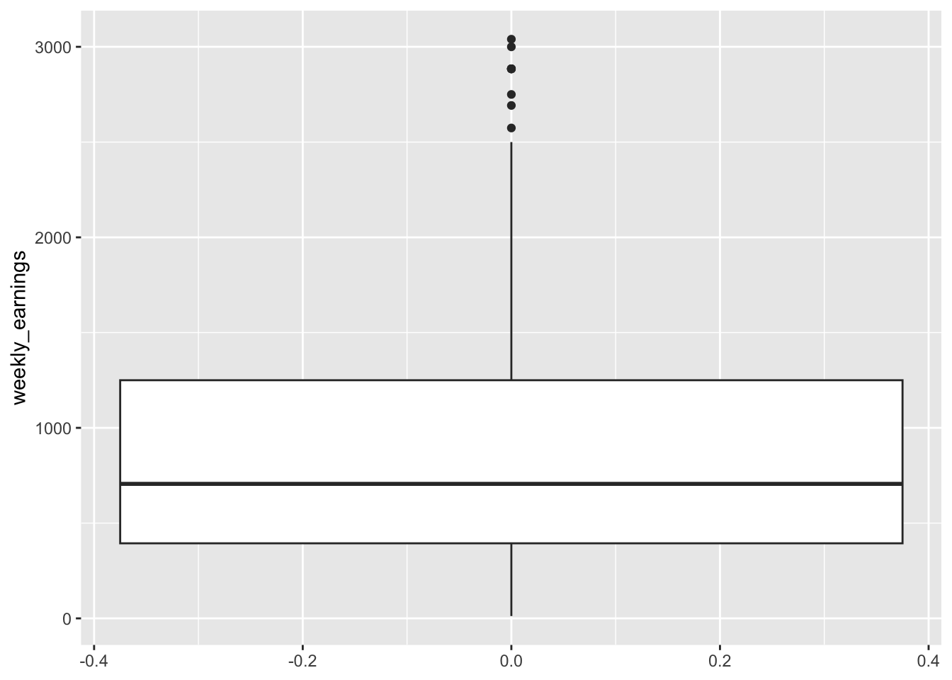
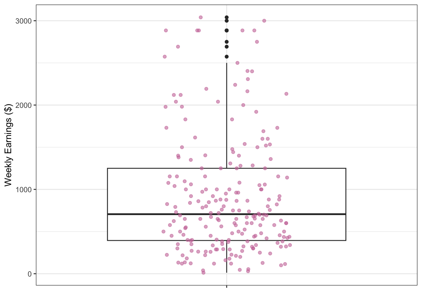
Figure 3.9: Boxplot of weekly earnings
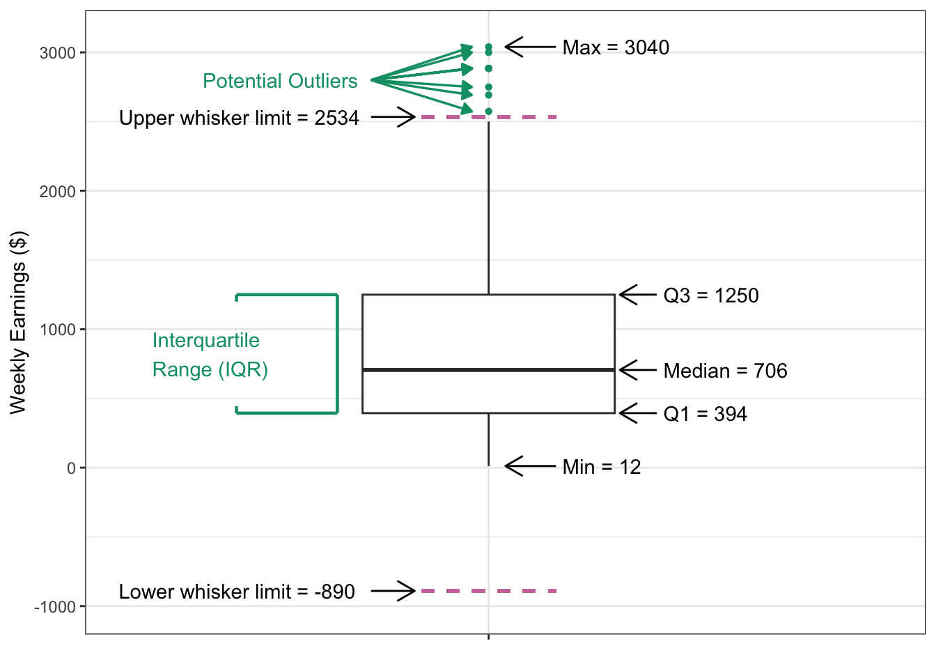
Figure 3.9 looks like an interesting plot! What does it represent though? We show an annotated version of this boxplot in Figure 3.10. Each component of the boxplot represents a specific statistical measure of the data distribution of weekly earnings. Looking at the annotated figure let’s try to understand each part, one by one.
The box itself represents the Interquartile Range (IQR), which represent the range of middle 50% of all data points and spans from the first quartile (Q1 = $394) to the third quartile (Q3 = $1250), and hence IQR = Q3 - Q1 = $856. The horizontal line within the box marks the median value of $706, which is the point where exactly half of the observations fall above and half fall below.
The whiskers extend from the box to show the range of typical values in the dataset. The lower whisker reaches down to the lower whisker limit of $-890, while the upper whisker extends to the upper whisker limit of $2534. These limits are used as bounds to determine if the data have any potential outliers, which are values that do not follow the overall pattern of the data and are too large or too small compared to the rest of the data. The limits are calculated as 1.5 times the IQR distance from the box edges. In this instance, the lower whisker limit is \(Q1 - 1.5IQR = 394 - 1.5\times856 = -890\). On the other hand, the upper whisker limit is \(Q3 + 1.5IQR = 1250 + 1.5\times856 = 2534\).
The minimum value in the dataset is $12 so the lower whisker actually stops there rather than extend all the way to its limit of $-890. The maximum value is $3040, which is above the upper whisker’s limit of $2534, so the upper whisker extends all the way up to its limit. Note that, in addition to the maximum value, there are many other points that are observed above the upper whisker limit of $2534. Any data points beyond the whisker limits are then considered potential outliers and are plotted as individual points.
Figure 3.10: Annotated boxplot
This visualization in Figure 3.10 effectively summarizes the central tendency, spread, and extreme values of weekly earnings, making it easy to identify both the typical range of values and any unusual observations that might warrant further investigation. It does not however, show each individual observation other than the ones that are beyond the upper whisker limit. In Figure 3.11, we have overlaid each observation (i.e., each survey respondent student’s weekly earnings) onto the boxplot. Again, the x-axis is not meaningful, the points are only spread out so that they are visible and not on a single vertical line. This should make it clear that about a quarter of the points are below the box, a half are in the box, and a quarter above the box.
Figure 3.11: Boxplot overlayed with individual observation points
We can use a boxplot when
have numeric data
want to identify the central tendency and spread of the data
want to check if the data has any potential outliers
So far we have explore one variable at a time, but in real life, we often want to explore the relationship between two variables rather than examining them in isolation.
3.3 Visualizing Two Variables
Understanding how variables relate to each other can reveal important patterns and insights that aren’t apparent when looking at single variables alone. In this section, we’ll explore different plots for visualizing relationships between pairs of variables.
3.3.1 Visualizing Two Categorical Variables
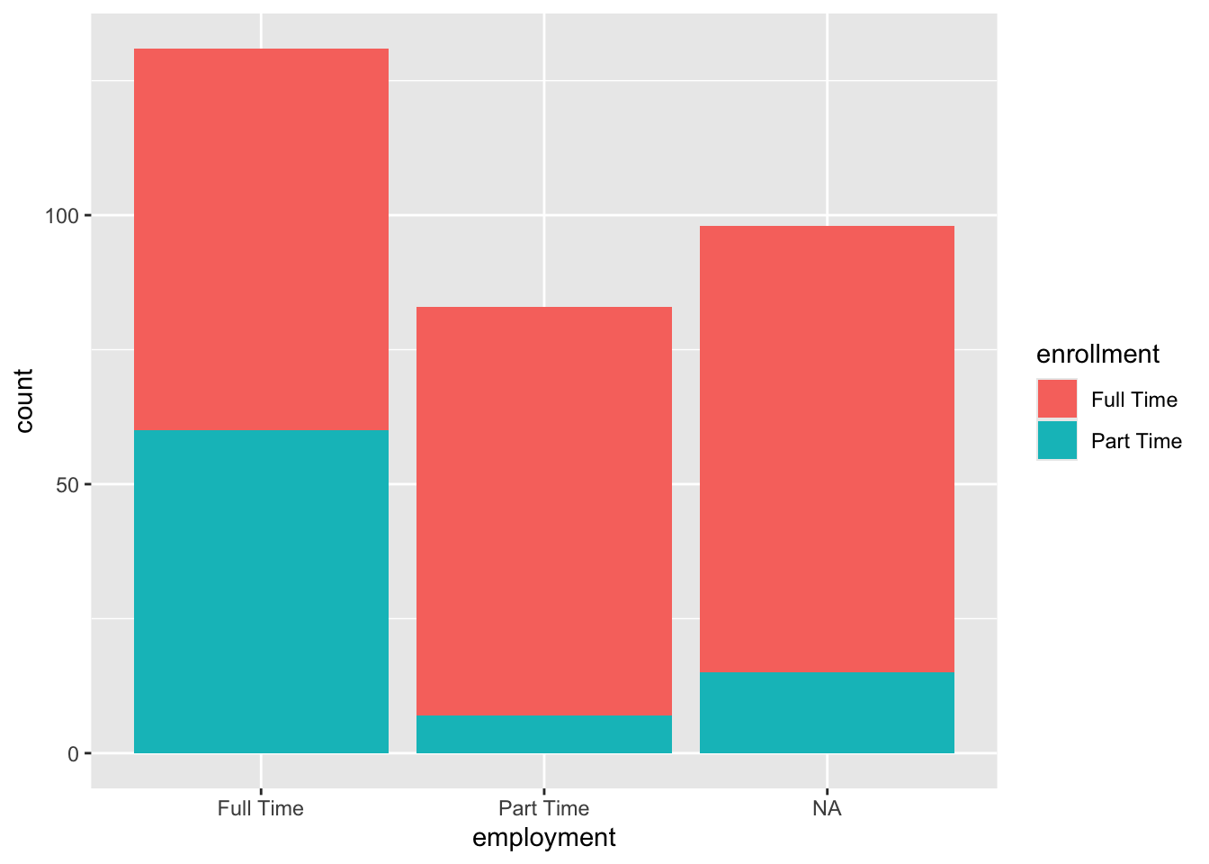
When we have two categorical variables, we want to understand how the categories of one variable are distributed within the categories of another. A stacked bar chart is particularly useful for this purpose because it shows both the overall distribution of one variable and how it breaks down based on the second variable.
Let’s make a visualization to examine the relationship between employment status and enrollment status, which are both categorical variables. In Section 3.2.1 we already did a bar plot to look at the distribution of employment. We will keep the code and the plot very similar.
We add mapping of enrollment variable to the fill aesthetic. This will fill each bar based on the enrollment numbers.
Figure 3.12: Stacked barplot of employment and enrollment status
This stacked bar chart shows the relationship between employment status and enrollment status among those enrolled in college. The x aesthetic maps employment categories to the x-axis, while the fill aesthetic uses different colors to represent enrollment categories within each employment group. This allows us to see not only how many students fall into each employment category, but also how enrollment status varies within each employment group.
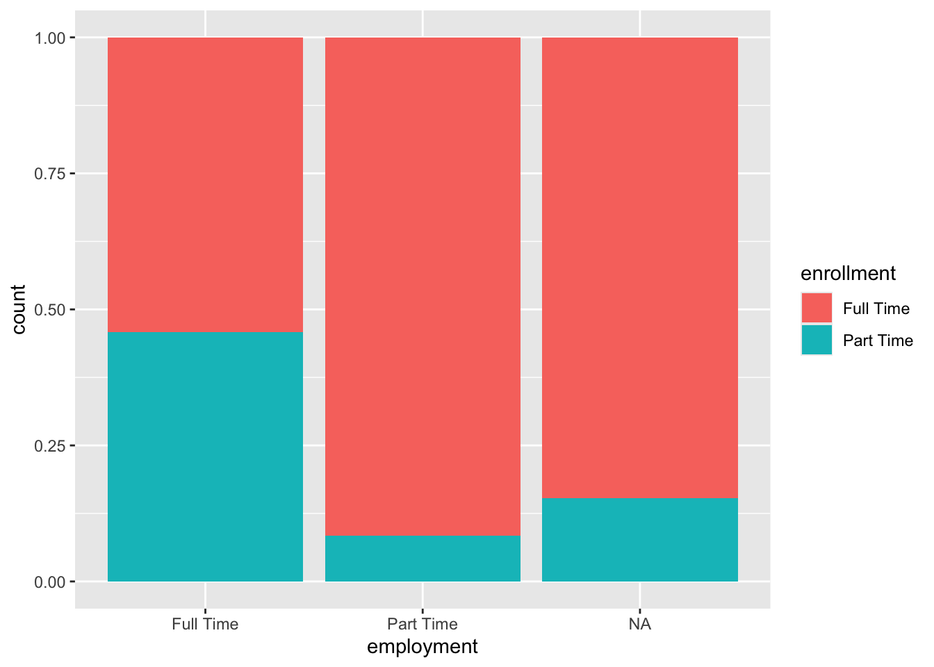
There are different ways we can position the bars in a bar plot. One way we can do this is by having stacked bars.
We can get a stacked-bar plot by setting the position = "fill" within the geom_bar() function.
Figure 3.13: Standardardized stacked barplot of employment and enrollment
Each bar is scaled to the same height (representing 100% of observations in that employment category), and the colored segments show the relative proportions of each enrollment status within each employment group. This visualization is particularly useful for comparing the composition or distribution patterns across categories, as it eliminates the effect of different group sizes and focuses purely on proportional relationships. Note that ggplot still indicates count on the y axis despite displaying a proportion. We will learn how to change this label in Chapter 4.
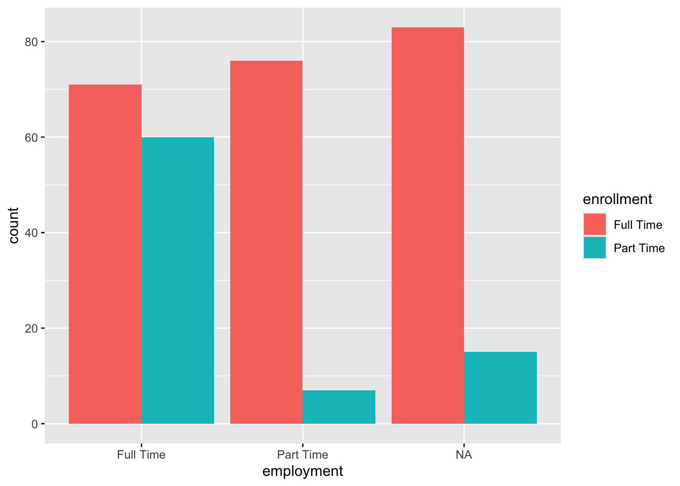
We can also position the bars next to each other in a dodged fashion rather than stacking them on top of each other.
For a dodged bar plot we set position = "dodge" within geom_bar().
Figure 3.14: Side-by-side (dodge) barplot of employment and enrollment status
In a dodged bar plot, bars for different enrollment categories are placed side-by-side rather than stacked. This approach makes it easier to compare the actual counts or frequencies of each enrollment status across employment categories, as each bar’s height directly represents the number of observations. The grouped layout allows for direct visual comparison of bar heights both within and across employment groups.
3.3.2 Visualizing Two Numeric Variables
When we look at two numeric variables, we often want to explore their relationship, and the most effective visualization is a scatterplot. In a scatterplot, one variable is mapped to the x-axis and the other to the y-axis. We often think of y as a function of x, meaning that y is the one that could possibly react or change based on changes in x. Hence x is called the explanatory variable; whereas y is called the response variable. Through the use of a scatterplot, we want to determine if and how the explanatory variable (\(x\)) associates with the response variable (\(y\)). Each point represents an observation and its location shows the combination of values for both variables for that particular observation.
To classify the variables, we need context or information on how one would influence the other. For example, the number of hours a student studies for an exam would likely influence their exam score. In this case, \(x\) is the number of hours studying, and \(y\) is the exam score. If the relationship is not clear or logical, then the assignment is up to the data scientist’s discretion.
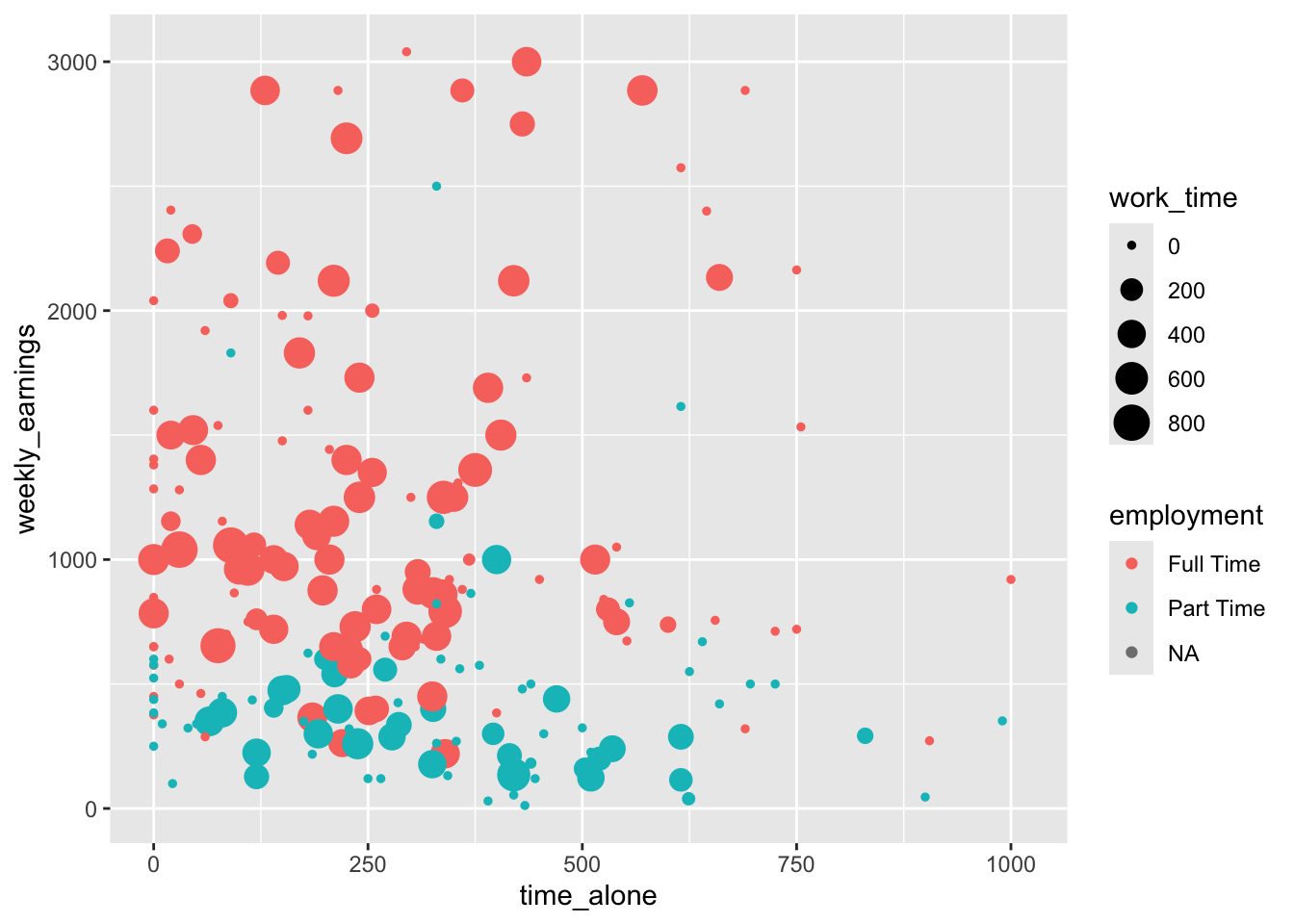
Let’s create a scatterplot to examine the relationship between time spent alone (in minutes) and weekly earnings (in dollars) among college students. In this case, we have chosen time spent alone to be plotted on the x-axis and weekly earnings on the y-axis because we of then think of money being a function of time, regardless of where that time is spent.
To understand the relationship between time_alone and weekly_earnings, time_alone is mapped to x-axis and weekly_earnings mapped to y-axis.
2
To add a layer of a scatterplot we utilize geom_point().
Figure 3.15: Scatterplot of time spent alone and weekly earnings
Each point represents one student, positioned according to how much time they spend alone (x-axis) and their weekly earnings (y-axis). By plotting all observations this way, we can look for patterns such as positive or negative relationships, clusters of data points, or potential outliers. For instance, we can see that there are fewer points in the upper right corner indicating that there are fewer students who spend longer time alone while also earning higher weekly income.
A relationship between two variables does not imply causation because their association simply tells us that the two variables move together in some way, but it does not prove that one variable causes the other to change. We need rigorously designed studies to establish causal relationships, which you will learn more about in a future chapter.
We can use a scatterplot when we want to
examine if a relationship between two continuous variables exists or not.
conduct a preliminary analysis before a more formal statistical test looking for particular types of relationships (e.g., we might look to see if weekly earnings decrease when time spent alone increases or vice versa).
identify potential outliers.
3.3.3 Visualizing a Numerical and a Cateogorical Variable
When we want to explore the relationship between a categorical variable and a numerical variable, we need visualization techniques that can show how the distribution of the numerical variable differs across the categories. There are many ways to accomplish this, but one of the most effective and informative approaches is using side-by-side boxplots.
A side-by-side boxplot creates separate boxplots for each category of the categorical variable, allowing us to compare the distribution of the numerical variable across different groups. Each boxplot displays the five-number summary (minimum, first quartile, median, third quartile, and maximum) along with any potential outliers, giving us a comprehensive view of how the numerical variable behaves within each category.
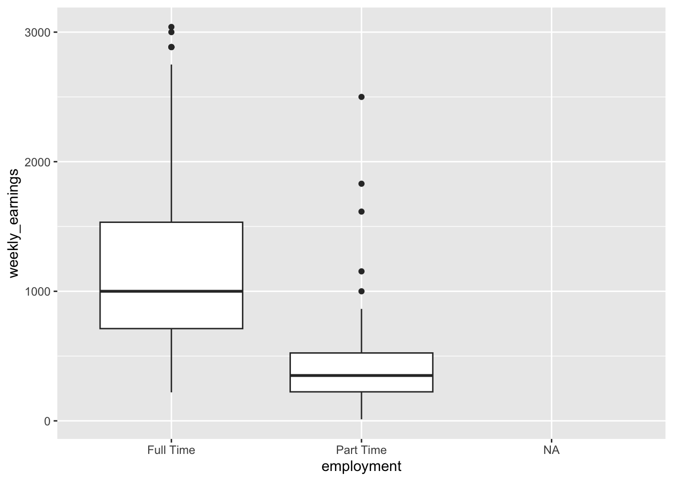
We want to compare weekly_earnings distribution of students based on their employment status.
This time we map our grouping variable to the x-axis, i.e., x = employment with y still being weekly earnings as in our previous example.
Figure 3.16: Side-by-side boxplots based on employment status
This visualization shows the distribution of weekly across different enrollment statuses. We see a boxplot for those enrolled full time, and those who are enrolled part time. However, for those whose employment status noted as NA there is no box. This is not an error on our end, in fact for those who have employment status not reported, there is also no weekly earning reported (i.e., also NA). It is possible that NA might be representing that those who are unemployed.
Each box represents the weekly earnings distribution for one enrollment category, making it easy to compare.
Which of the following can be concluded for certain based on the side-by-side boxplot of employment and weekly earnings. Select ALL that are true.
Among those who had weekly earnings, the highest weekly earning belonged to someone who was employed full time.
The first quartile of the full time employed students was greated than the third quartile of the part time employed students.
Full time employed category has fewer potential outliers than part time employed category.
In the full time employed category, there were more people who had weekly earnings between the third quartile and the median than the first quartile and the median.
examine the relationship between one categorical variable and one numeric variable
compare variability between different groups
compare distributions across different groups
compare the spread and central tendency of multiple groups side by side
3.4 Visualizing More Than Two Variables
Real-world data analysis often requires us to examine relationships among multiple variables simultaneously. While two-variable visualizations provide valuable insights, adding a third (or even fourth) variable can reveal more complex patterns and interactions that might otherwise remain hidden. Let’s consider one applied case that builds naturally on the scatterplot we’ve already learned.
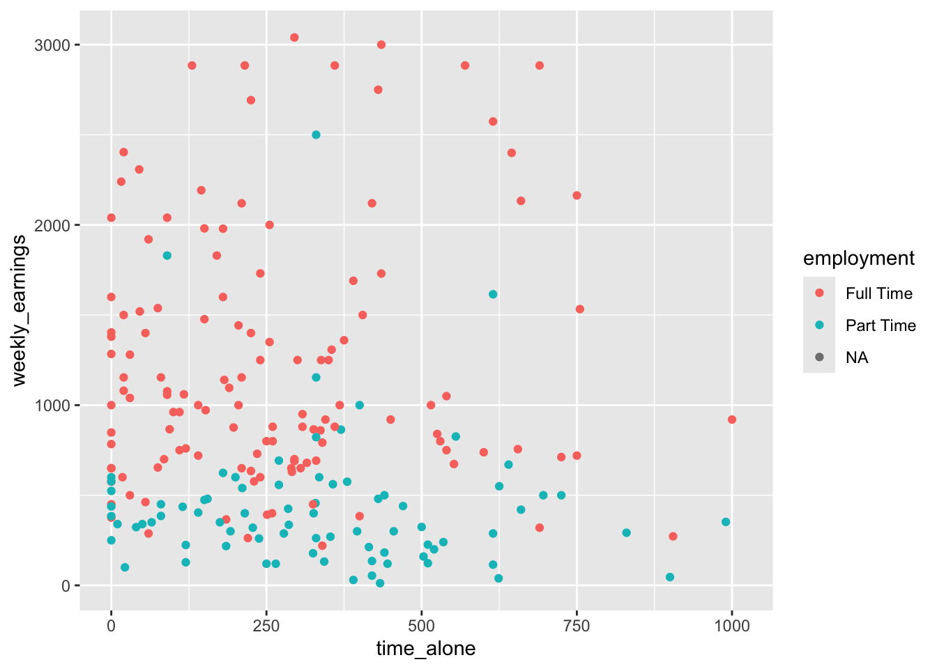
Building onto the previous scatterplot code we have written, we will identify each student (i.e., point) by a color that differentiates their employment status.
We do this by mapping the employment variable onto the color aesthetic.
Figure 3.17: Grouping points by color based on employment status
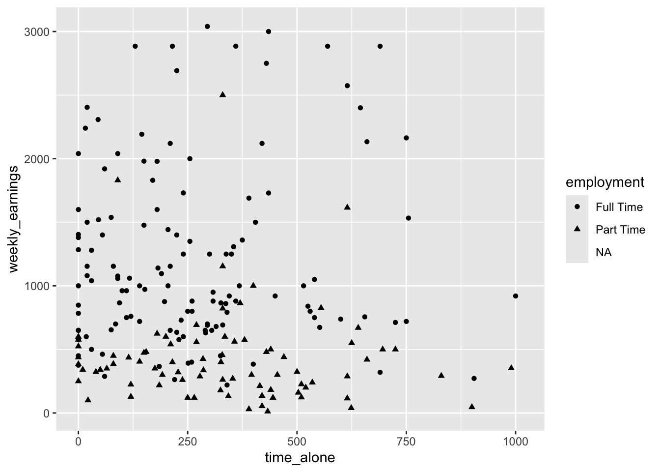
Mapping the employment variable reveals that weekly earnings seems to show a pattern based on whether a student works full time or part time. We could alternatively differentiate each point by mapping the employment status to the shape of the point. Different point shapes (circles, triangles, squares, etc.) distinguish between enrollment categories. This approach can be particularly useful when printing in black and white or when color distinctions might not be clear for all viewers.
Theemployment variable is mapped to the shape aesthetic.
Figure 3.18: Grouping points by shape based on employment status
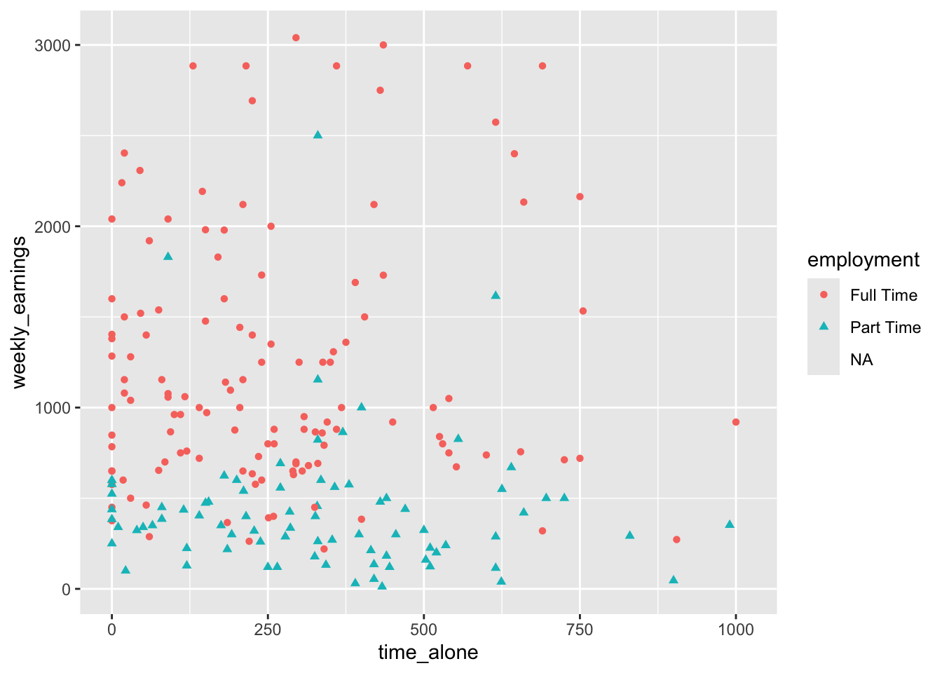
For maximum clarity and accessibility, we can combine both approaches by mapping employment to both color and shape. This redundant encoding ensures that the enrollment categories are distinguishable regardless of whether someone can perceive color differences, and it makes the patterns even more apparent to all viewers.
Warning: Removed 102 rows containing missing values or values outside the scale range
(`geom_point()`).
Figure 3.19: Using both color and shape to group points
Visualizing time_alone, weekly_earnings, and employment allows us to explore questions like: Do students with different employment statuses show different patterns in the relationship between time spent alone and weekly earnings? Are there employment groups that cluster in particular regions of the plot? These insights would be impossible to detect when examining the variables separately.
One last aesthetic we want to consider in this chapter is size. While color and shape aesthetic allowed us to consider a categorical variable (e.g., employment), size can allow us to visualize an additional numeric variable. The size aesthetic allows us to map a fourth variable (e.g., work_time) to the visual size of the points, creating an even more complex multivariable visualization.
The work_time variable which is numeric, is mapped to size aesthetic.
Figure 3.20: Adding a numerical variable to differentiate points based on size
The size aesthetic maps work_time to the diameter of each point - students who work more hours are represented by larger points, while those who work fewer hours appear as smaller points. This creates a bubble chart effect where we can possibly identify patterns such as whether students who work more hours (larger bubbles) tend to have higher earnings, or whether work time varies systematically across employment statuses.
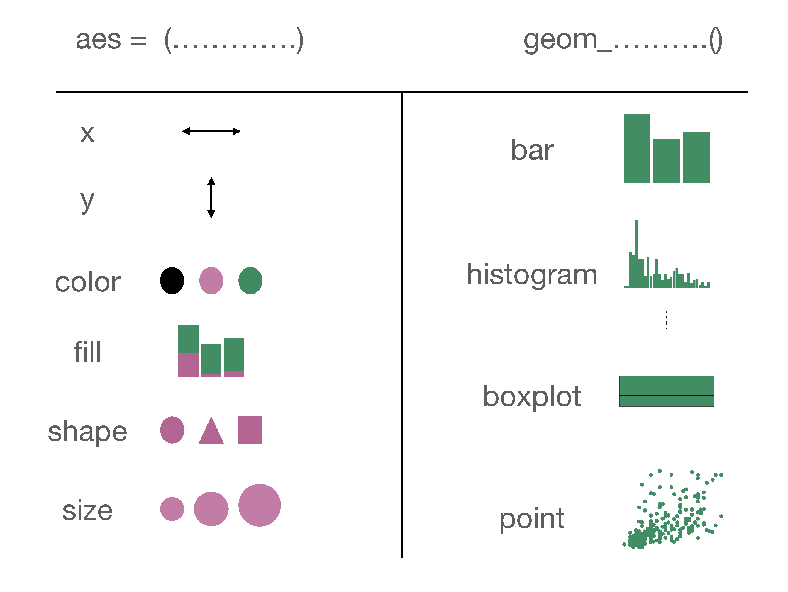
It is worth noting that many of the features we have shown in this chapter was from a technical point of view, what you can and cannot do in a basic visualization. Just because you can get R to visualize four variables at the same time does not necessarily mean that you should. Whether you should do these or not is the topic of Chapter 4. Let’s finish this chapter up by summarizing the key points of ggplot code. In Figure 3.21 you can see a summary of different aesthetic arguments and geom objects that we covered in this chapter.
Figure 3.21: A Summary of aesthetics and geom objects covered in this chapter
Only a and b can be concluded for certain. At a first glance c might seem correct as we see 3 points and 5 points for the full time and part time categories respectively. However, we don’t know if there are any points on top of each other. For instance in Figure 3.10 there were 10 outliers but each of these points were not visible until we looked at Figure 3.11. So we cannot know choice c for certain. Choice d is incorrect. About 25% of the people is between the third quartile and the median and about 25% of the people is between the first quartile and the median.↩︎