In Chapter 3, we represented data using visualizations at a very basic level. Throughout Chapter 3 we relied on default settings of the {ggplot2} package. It is now time to deviate from the default settings. There are multiple features of data visualizations that we can improve to make them easier to comprehend. We will learn about some of these features in this chapter. We will also continue to improve data visualizations in Chapter 9. Even though a data visualization might be an effective summary of data, it is not always an accessible one. In this chapter we will also focus on accessibility and learn about different representations of data.
Change the default settings of ggplots to make them easier to comprehend
Improve the look of visualizations by adding labels, color, and other features
Represent data in formats other than visual including text, sound, and tactile
Data scientists often create products for others to use. A data product, for instance, might be a report, code or a dashboard. No matter what kind of products are made, it is important that these products are accessible to all. Needless to say “all” includes people with disabilities. As there are many different kinds of disabilities, consideration of accessibility goes beyond what we cover in this chapter.
Let’s go ahead and load the packages for this chapter.
library(hellodatascience)library(tidyverse)
── Attaching core tidyverse packages ──────────────────────── tidyverse 2.0.0 ──
✔ dplyr     1.2.1     ✔ readr     2.2.0
✔ forcats   1.0.1     ✔ stringr   1.6.0
✔ ggplot2   4.0.3     ✔ tibble    3.3.1
✔ lubridate 1.9.5     ✔ tidyr     1.3.2
✔ purrr     1.2.2
── Conflicts ────────────────────────────────────────── tidyverse_conflicts() ──
✖ dplyr::filter() masks stats::filter()
✖ dplyr::lag()    masks stats::lag()
ℹ Use the conflicted package (<http://conflicted.r-lib.org/>) to force all conflicts to become errors
4.1 Improving Data Visualization
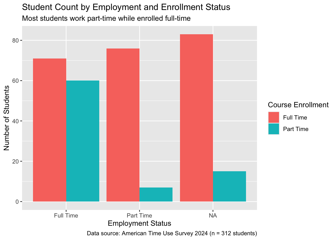
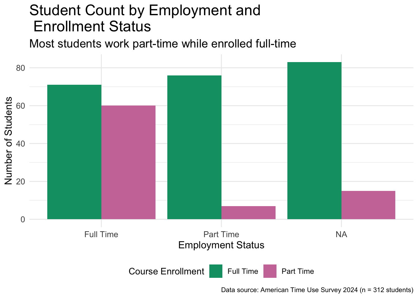
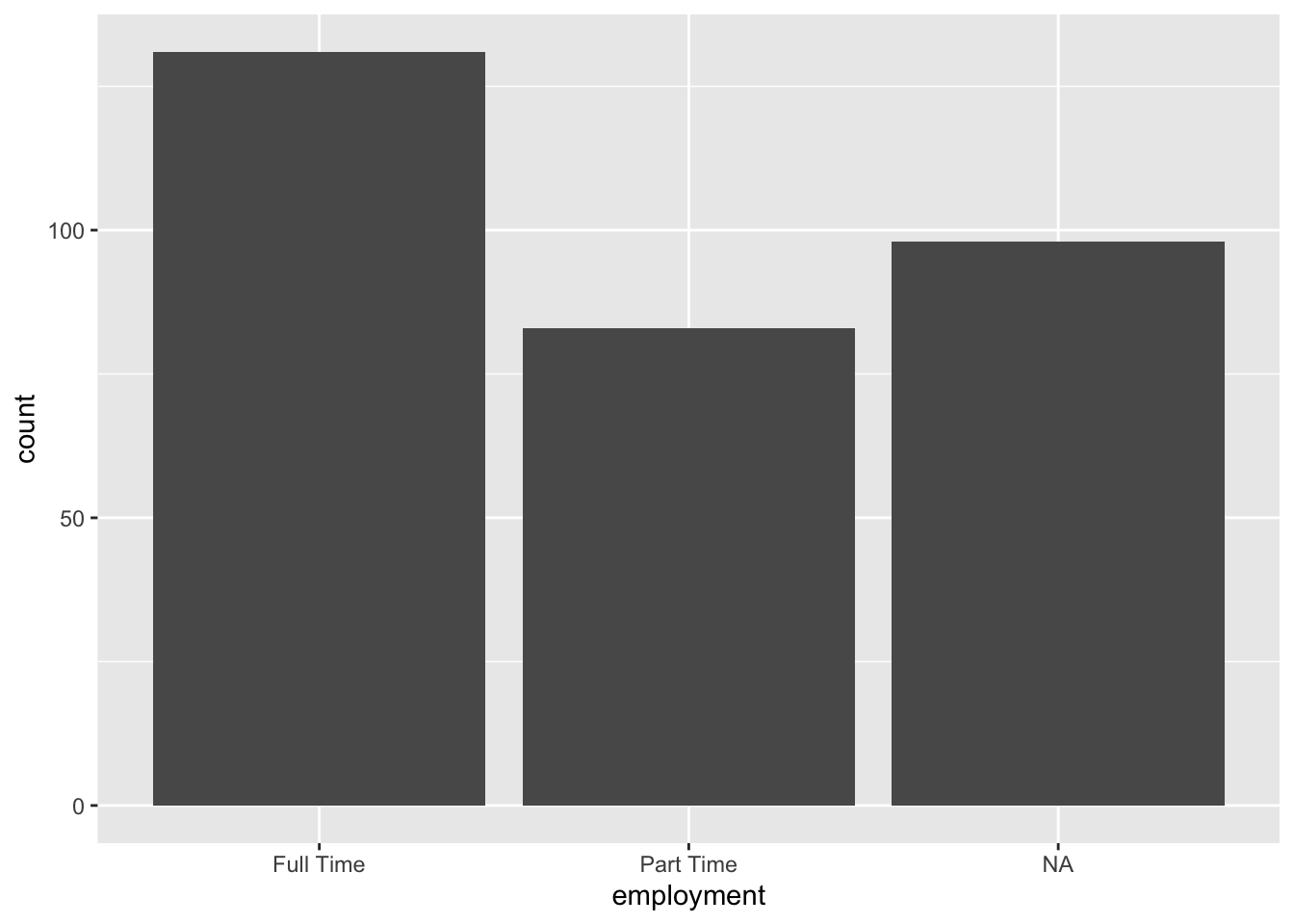
In this section we will reuse the dodged barplot we created in Chapter 3. We will save it as an object called base_bar_plot and then try to improve it throughout the section.
We are saving the plot by assigning it the object name base_bar_plot. Since we will reuse this plot, it is a good idea to give it a name.
2
When we call the object name, the plot will be printed.
Figure 4.1: Side-by-side bar plot of employment broken down by enrollment status
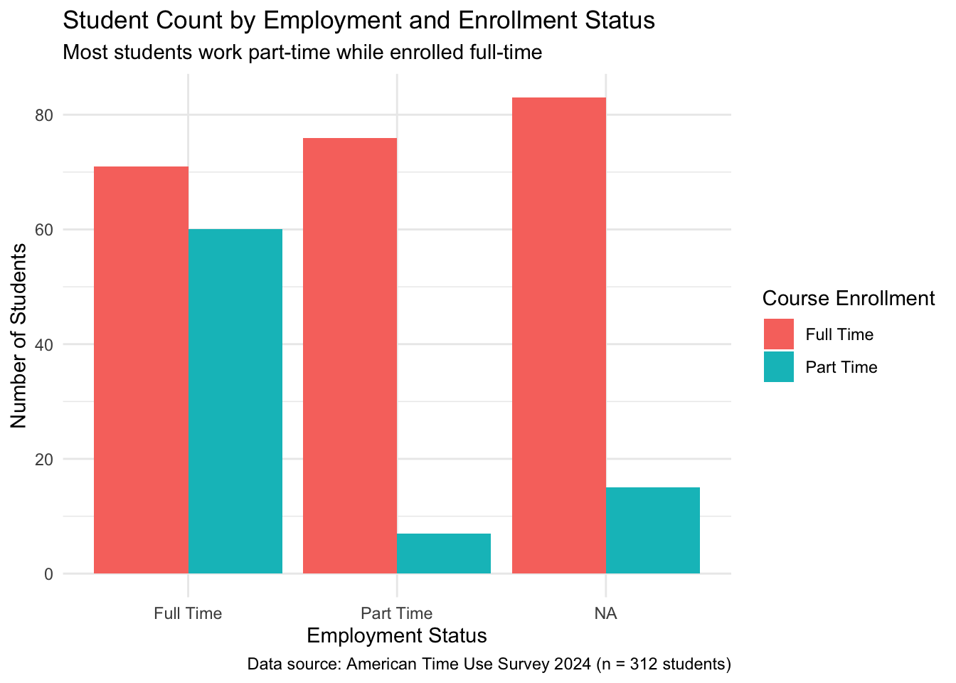
4.1.1 Labels
You might have noticed that by default ggplot uses variable names coming directly from the data as labels for axes and legends. Variables are not always appropriately named and even when they are, they do not follow natural language writing practices such as capitalization and spacing. Thus, it is important to write descriptive labels for titles, axes, and legends and avoid abbreviations when possible.
improved_bar_plot <- base_bar_plot +1labs(2title ="Student Count by Employment and Enrollment Status",3subtitle ="Most students work part-time while enrolled full-time",4x ="Employment Status",5y ="Number of Students",6fill ="Course Enrollment",7caption ="Data source: American Time Use Survey 2024 (n = 312 students)" )improved_bar_plot
1
We add a layer of labels using the labs() function. The labs() function allows us to control several different labels in a plot.
2
The title argument sets the title of the plot. Not every plot needs a title. For instance, without a title of this plot, the viewer could still understand the plot.
3
The subtitle argument sets the subtitle with a smaller font than the title.
4
The x axis label was previously the variable name, employment but now we are able to set it to something cleaner as “Employment Status”
5
The y axis label defaulted to count but now is set to “Number of Students”.
6
The legend was created using a fill argument and hence the label of it is also changed using the same argument.
7
The caption is a great place to note down data source as well as the total number of observations.
Figure 4.2: Bar plot of employment broken down by enrollment status with added labels
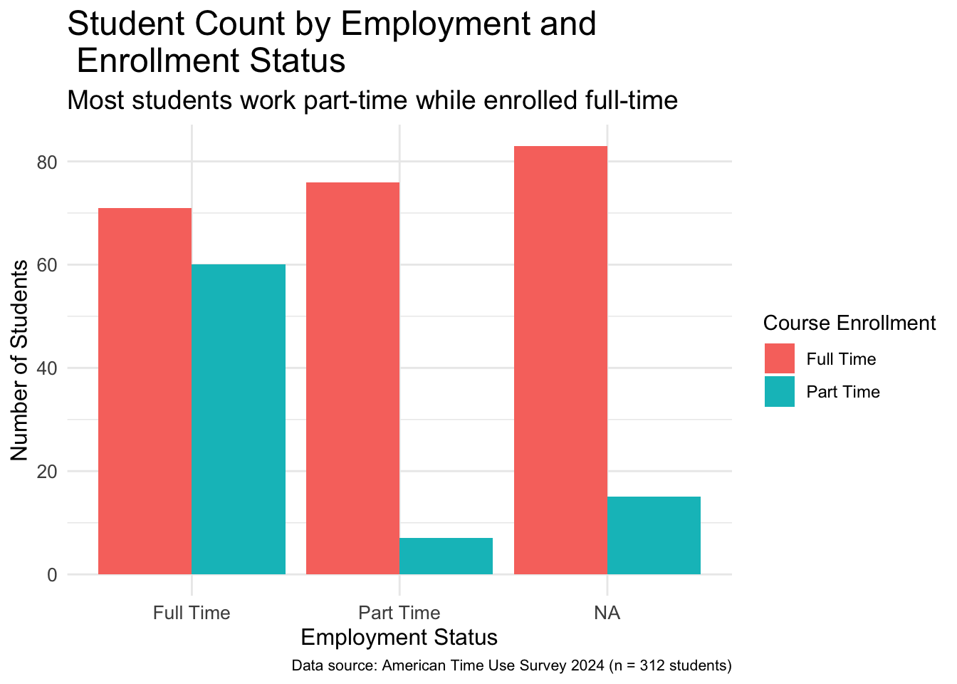
4.1.2 Themes
Themes in the {ggplot2} package control all the visual elements of your plot that are not related to the data you are working with, such as the background colors, grid lines, text fonts and sizes, axis styling, legend positioning, and overall aesthetic appearance. Think of themes as an added styling layer that sits on top of your data visualization, determining how professional, clean, or visually appealing your plot looks without changing the actual data being displayed. There are several built-in themes that change the look of your plots, and you can also create custom themes or modify existing ones to match your personal preferences. In addition, many organizations create their own themes.
When we do not specify a theme, ggplot uses theme_gray() by default. Notice the gray background in all the ggplots we have done so far. Let’s go ahead and change from the default theme to minimal theme.
The theme_minimal() layer changes many elements of the plot, most notably the background.
Figure 4.3: Bar plot of employment broken down by enrollment status with using theme_minimal
There are many other themes you can try out including but not limited to theme_bw(), theme_light(), theme_dark(), theme_minimal(), and theme_classic(). Using built-in themes is one way you can change how the visualization looks. If you do not want to rely on built-in themes, then you can use the theme() function to make specific changes.
The default font size is small for many plots. We cannot overemphasize the importance of changing the font size of the plots especially when using plots on presentations displayed with a projector. The following code chunk changes font size of different parts of the plot.
The theme() function can take several arguments related to font size. All these arguments first specify which element to change font size of and then followed by element_text() function within which, size is set a desired font size.
2
For instance, the font size of the title of the plot is set by the argument plot.title.
3
Because the title now has a much larger font size it would not fit on a single line and would overflow outside of the plot. Hence, we used \n to add a line break in the title.
Figure 4.4: Bar plot of employment broken down by enrollment status with bigger font sizes
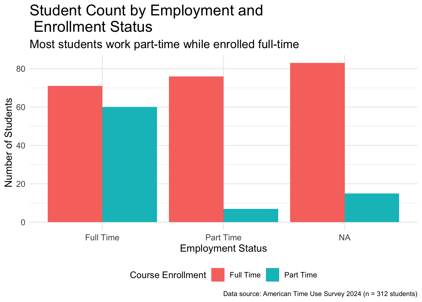
The theme() function can also help us change the location of the legend as follows.
The legend.position argument within the theme() function can take several arguments including left, right, bottom, center, and top.
Figure 4.5: Bar plot of employment broken down by enrollment status with legend at the bottom
The changes one can do using the theme() function might seem endless. Hence, we highly encourage you to check the documentation for the theme() function (i.e., ?theme) to see the various arguments it can take. Even experienced R and tidyverse users do not memorize every function argument. That’s why the documentation is there to help us remember what we can change and how to make those changes.
Using the documentation of the theme() function make one more additional change of your choice to the improved_bar_plot.
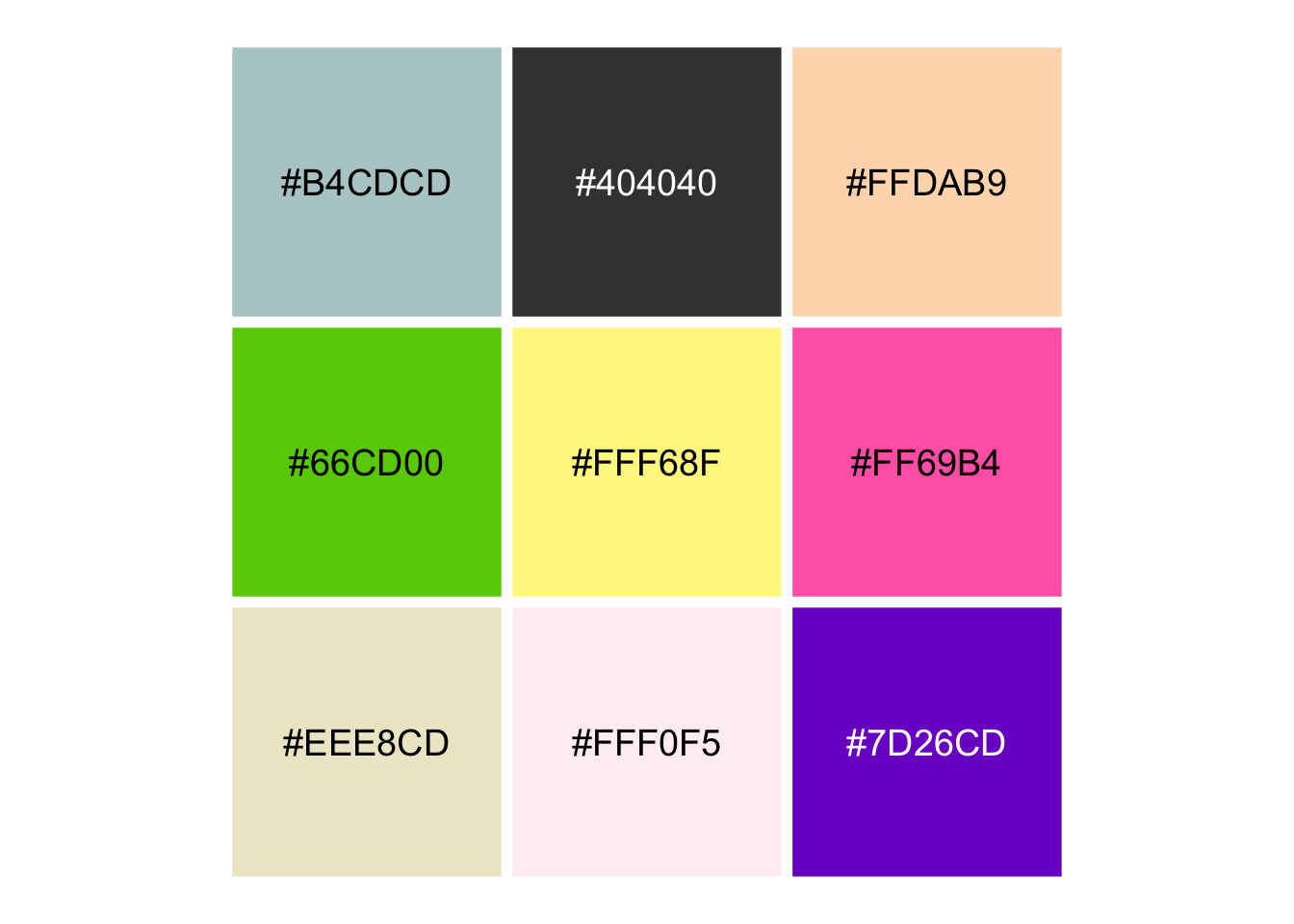
One thing that makes the kid come out of many data scientists is the coloring activity! Yes, you can choose colors for your data visualizations. You can find a list of colors in R by using the colors() function. This will print out all the color names that R recognizes. There are 657 of them! Figure 4.6 shows a random selection of nine of these colors.
Figure 4.6: Nine colors randomly selected from R colors as listed by the colors() function
Even though using color names in R can be easy, since the color “hotpink” makes sense to many of us, this color can be named differently in different software and programming languages. Instead of using these names, within R, we can also use hex codes of colors. A hex code is a six-character code starting with a hash (#) that defines a color in digital media. Figure 4.7 show the hex code of the nine randomly selected colors from Figure 4.6.
Figure 4.7: Hex codes for the randomly selected nine colors
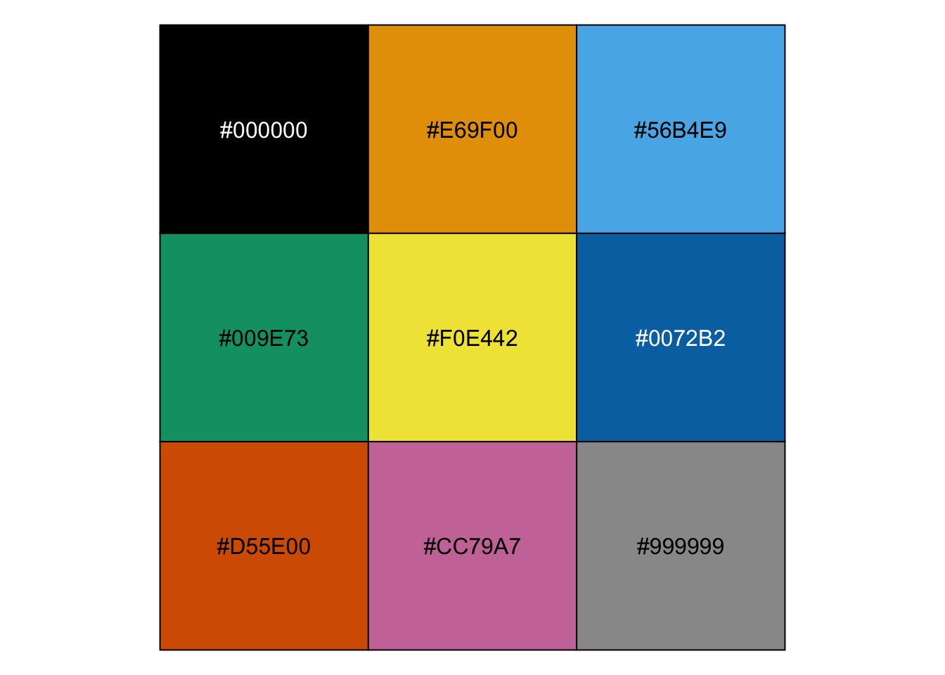
In terms of accessibility, one thing to remember is that not everyone can distinguish between all colors. The Okabe-Ito color palette was developed by Masataka Okabe and Kei Ito specifically to make visualizations accessible to color blind individuals (2008). The hex codes of colors in the Okabe-Ito palette is as follows and these colors are shown in Figure 4.8.
Figure 4.8: Hex codes of colors in the Okabe-Ito palette
We will go ahead and use two of these colors in the bar plot that we have been working on. Yes, these two colors are indeed two of three colors we use throughout the book!
The scale_fill_manual() function allows you to manually specify colors for fill aesthetics.
2
The values argument defines what colors to use and the c() function creates a vector with a combination of these values.
3
The category “Full Time” is assigned the color with the hex code “#009E73” which corresponds to the green color as shown in Figure 4.8.
4
The category “Part Time” is assigned the color with the hex code “#CC79A7” which corresponds to the pink color as shown in Figure 4.8.
Figure 4.9: Bar plot of employment broken down by enrollment status using Okabe-Ito colors
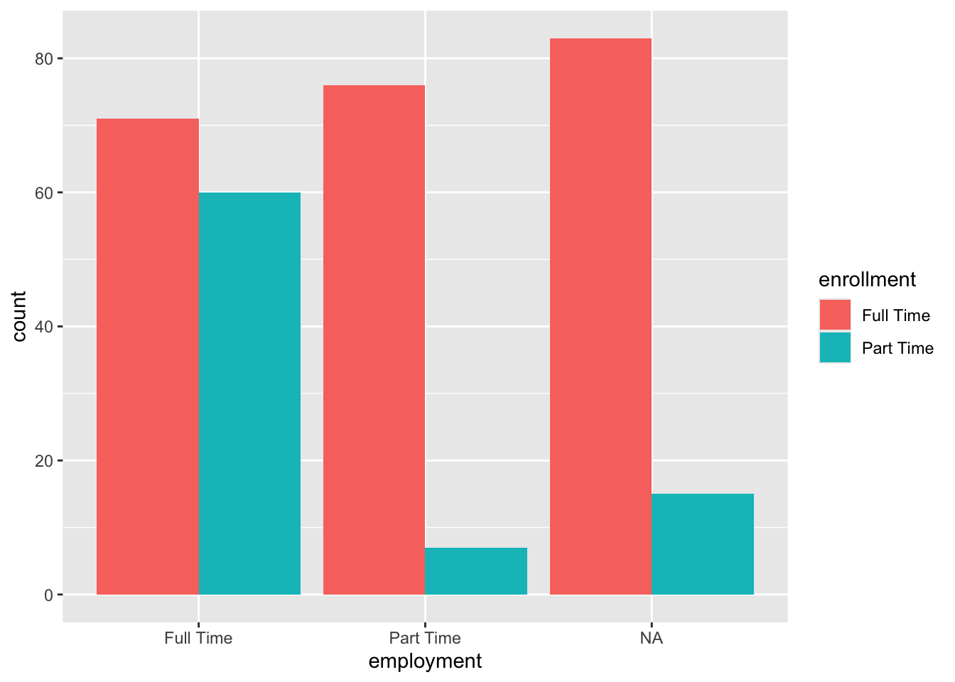
Recall the base_bar_plot we made earlier in the chapter with the default ggplot setting. We will print the base bar plot right here so that you can directly see how far we have come with this plot by comparing it to improved_bar_plot.
base_bar_plot
Figure 4.10: Basic (defualt) bar plot of employment broken down by enrollment status
4.1.4 Additional Style Elements
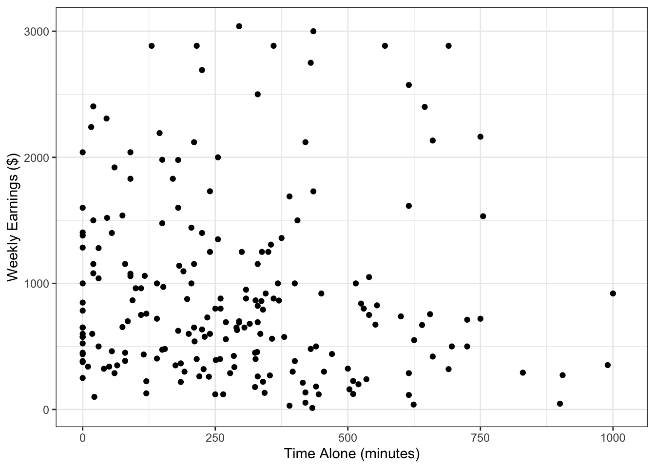
If your goal is to simply change the look of a scatterplot by changing the color, size, or shape of all the points then we can do that too. Let’s look at the scatterplot that we created in Section 3.3.2.
Warning: Removed 102 rows containing missing values or values outside the scale range
(`geom_point()`).
Figure 4.11: Scatterplot of time spent alone and weekly earnings
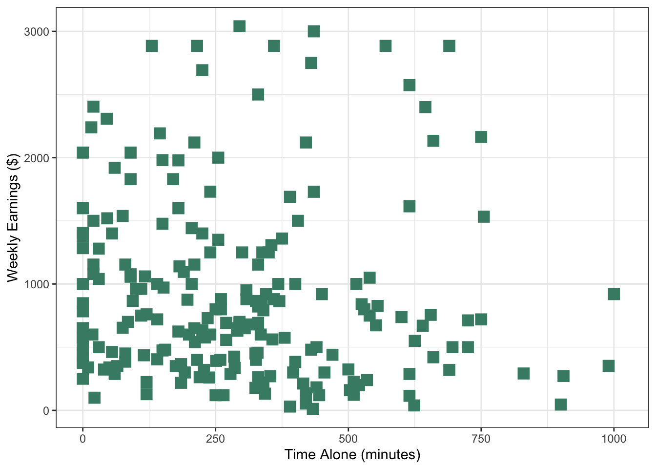
Previously, we used color to group points based on a categorical variable and we did so by stating it inside the aesthetics. However, this time we do not want to group points, we now want to just change the look of all the points. In this case we do so by making the specifications inside the geometric layer function.
We used one of the colors from the Okabe-Ito palette, but you can use any of the ones listed by the colors() function or using a hex code.
2
The size of a point is in millimeters (mm). In this case we chose a size 4 to make the points a little bigger than the default.
3
You can choose from a variety of common shapes: square, triangle, circle open.
Figure 4.12: Scatterplot with customized appearance of points
You can also customize the other visual elements of the plot, such as adding a title and fonts, in a similar way as we did with the bar plot using themes and labels.
We specified "aquamarine4" in the geom_point() function to change the color of the points to some version of green. How would you change all the bars in the following plot to be purple?
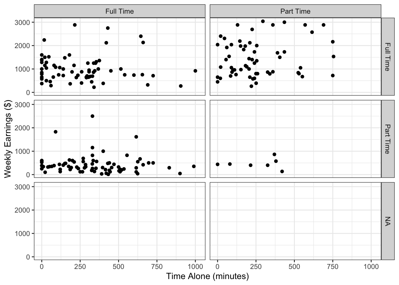
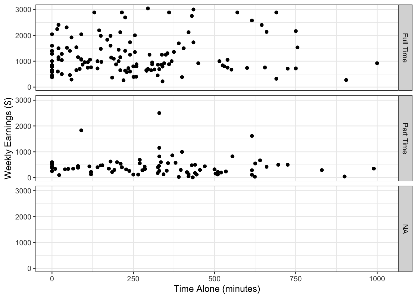
Using colors is one way to distinguish different groups in the data, as we saw in Figure 3.17. An additional feature you can consider is facets, which is an added layer used to create separate panels to distinguish groups.
We will use the facet_grid() function with the simple_scatterplot to show weekly earnings versus time alone for combinations of levels of employment status and enrollment status.
The facet_grid() function creates grid of plots where the rows and columns correspond to different data combinations or the variables provided to the vars() function.
Figure 4.13: Time spent alone versus weekly earnings broken by employment and enrollment status using facets
It is also possible to just create row wise grids without creating columns (or vice versa) as follows.
Figure 4.14: Time spent alone versus weekly earnings broken by employment status
4.2 Data Verbalization
“A picture is worth a thousand words” is a common saying, but for people who cannot see, an image is worthless unless words are written out explicitly to describe the image. So for anyone who cannot see any part of a data visualization, the visualization can be explained in words.
Before we delve into the verbalizing data, let’s familiarize ourselves with assistive technologies. An assistive technology is any form of technology (software, device) that helps people with disabilities perform certain activities (e.g. walking sticks, wheel chairs). A screen reader is a form of assistive technology that allows blind and visually impaired users, and people with other disabilities (e.g., dyslexia) to read what is on their computer screen. If you have never heard of a screen reader reading a text, you can listen to this audio.
A screen reader can read text, but non-text elements such as images cannot be read. Instead a screen reader would say something along the lines of “Image.png”. As you probably guessed, this is not a very helpful description for someone who cannot see the image. In order to make an image visually accessible, we can rely on alternate text. Alternate text or alt text describes contents of an image and can be read by screen readers.
Let’s learn to write an alternate text for the improved bar plot we created in Figure 4.9. We use the labs() function with the alt argument to write an alternate tax for the plot.
improved_bar_plot +labs(alt ="Barplot showing student count by employment and enrollment status. The y-axis shows number of students from 0 to 80, and the x-axis shows employment status (Full Time, Part Time, NA). Each employment status is broken down by full time or part time enrollment status. The plot displays six bars: students enrolled full time with full time employment (approximately 70 students), part time employment (apprximately 75 students), and unknown employment (approximately 80 students) as well as students enrolled part time with full time employment (approxmately 60 students), part time employment (approximately 18 students), and unknown employment (approximately 15 students). Data source: American Time Use Survey 2024 (n = 312 students)." )
Figure 4.15: Bar plot of employment broken down by enrollment status with added alternative text in the background
The alt text is never displayed in the front end. When we used the alt argument in the labs() function, nothing has changed visually. The alt text is stored on the back end of a web page and is legible by screen readers. If you are reading this book using a screen reader, you should have heard the alt text for the plot above.
An effective alt text communicates the type of plot, labels of the axes, the variables represented, ranges and values for each variable and group as seen in the visualization. Most importantly alt text should convey the overall message of the visualization. Writing the overall message of the visualization is crucial and practicing this skill will help you take the time to understand the visualizations you work with in depth.
4.3 Data Sonification
Data visualization and verbalization are two ways one can represent data. Another way includes representing data with sound, i.e., data sonification. In a visualization, data values are represented with position (i.e., coordinate system), color, shape, etc. In a sonification, data values are represented with pitch, volume, or tempo. This allows researchers and analysts to listen to patterns, trends, and outliers in their datasets.
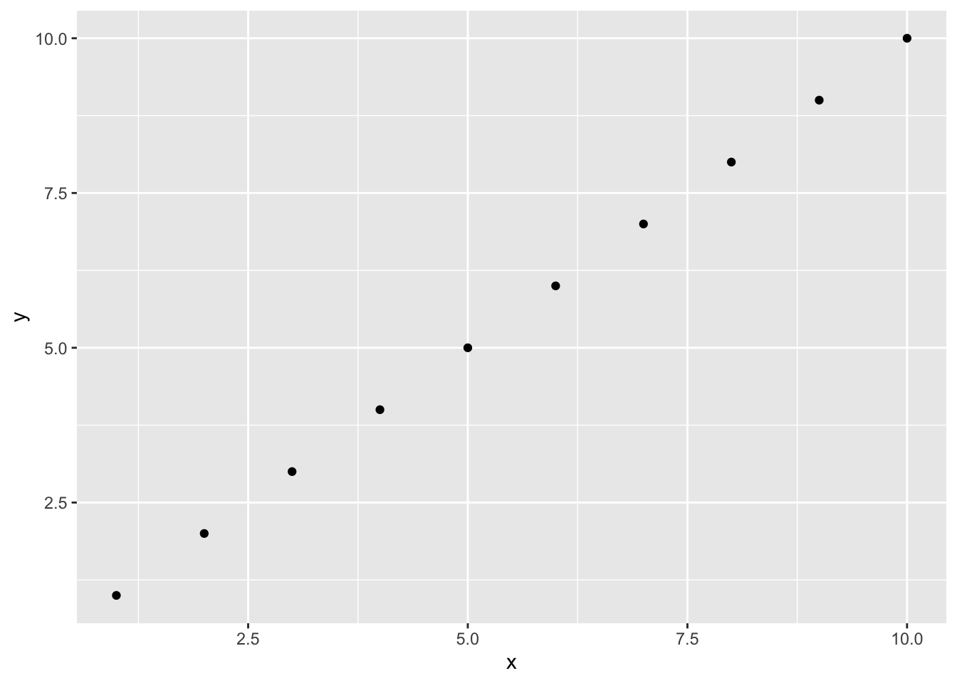
Consider the following R code which plots a straight, ascending line in an object called simple_plot.
x <-1:10y <-1:10simple_plot <-ggplot(data =data.frame(x = x, y = y),aes(x = x, y = y)) +geom_point()simple_plot
Figure 4.16: Simple scatterplot to show how sonify() function works
From this plot and the code it is evident that x values go from 1 to 10 and y values go from 1 to 10. We can also sonify x and y values using the sonify() function from the {sonify} package.
sonify::sonify(x, y)
If you were to listen to the output of the sonify() function, you would hear a series of ten tones, each one slightly higher in pitch than the last. The rising pitch directly corresponds to the rising y values as x increases. This auditory experience mirrors the visual experience of seeing the line go up and to the right, providing an alternative way to perceive the linear relationship between x and y.
Data sonification is an important part of data science. A leading pioneer in this field is Dr. Wanda Díaz-Merced, a Puerto Rican astronomer who is known for her groundbreaking work in using sonification to study stars. After losing her sight, Dr. Díaz-Merced developed techniques to turn the complex data from stellar radio waves into audible sound, allowing her to detect patterns in star emissions that might be missed by visual analysis alone. Her work demonstrates that listening to data can reveal insights that are not always apparent to the eye.
4.4 Data Tactualization
Beyond visualization, textualization, and sonification, we can also interpret data through the sense of touch. Data tactualization is the process of converting data into physical and touchable forms. Data tactualization employs physical properties like texture, shape, height, and temperature to represent data. This allows for a direct, physical exploration of patterns, structures, and relationships within a dataset.
While a ggplot() creates a visual line and sonify() creates a series of rising tones, a tactual representation would turn this into a physical object. Imagine a flat board with a raised line or a series of bumps embossed on its surface. As you trace your finger along the x-axis, the line would steadily rise higher, allowing you to feel the constant, positive slope. This physical sensation of a gradient directly communicates the data’s trend.
Okabe, Masataka, and Kei Ito. 2008. “Color Universal Design (CUD) - How to Make Figures and Presentations That Are Friendly to Colorblind People -.”\url{https://jfly.uni-koeln.de/color/}.
Answers for this question can vary. For example, we can change the panel background to whitesmoke color by adding it in a layer with the code theme(panel.background = element_rect(fill = "whitesmoke"))↩︎
If you considered adding color = "purple" to geom_bar(), we understand your reasoning. However, this would only change the borders of the bars. To change the colors of the bars add fill = "purple" to geom_bar().↩︎