- 1
- Create a pointer to the CSV. This does not import the data, instead it essentially creates an object which stores the location of the data.
- 2
- Export data from the csv to a parquet file.
9 Exploratory Data Analysis Project
From Chapter 1 through Chapter 8 you have learned valuable data science skills. In this chapter, we will learn how to synthesize our individual data science skills for real-world practice through exploratory data analysis (EDA). The steps of EDA vary, but as the name suggests, it is centered around an initial exploration of data. EDA can involve, but is certainly not limited to, obtaining data, posing research questions, data wrangling, summary statistics, visualizations, and communication of findings. A required skill for a data scientist is problem solving. In this chapter, we will encounter new problems and propose solutions, which will often utilize generative AI as a tool to problem solve, but other problem solving strategies can be chosen as well depending on preference and situation.
- Outline steps to achieve EDA goal
- Carry out an EDA from start to finish with decisions motivated by context and goals
- Utilize modern tools to problem solve and supplement investigation
- Communicate findings in a reproducible manner
9.1 Finding and Documenting Data
To get real-world practice with our new data science skills, we recommend finding a real publicly available dataset that interests you to explore. This way, you can generate you own investigation based on your own curiosity and discuss the results, not just the process. There are many places you can look for such data. Searching publicly available government data portals is a great way to find data local to your area. One example is data.gov, which has hundred of thousands of datasets available through the United States (US) government. We have compiled a list of places we recommend looking for real data https://hellodata-science.github.io/places-to-find-data/. Keep in mind that not all publicly available data is real, some sources like Kaggle are riddled with artificial datasets. Therefore, when you find a dataset that interests you, you should look into where the data originated from.
Once you do identify a dataset you want to use, make sure your work is reproducible by properly citing where you found your data. A proper data citation requires five main components: author, year of publication, dataset title, publisher/repository, and the DOI/URL. How you arrange this information depends on the discipline and is beyond the purposes of this chapter, but consistency in citation is key.
In this chapter we will use the PLACES: Local Data for Better Health, County Data, 2025 release dataset provided by the Centers for Disease Control and Prevention (CDC), Division of Population Health, Epidemiology and Surveillance Branch. This dataset contains estimates for 40 public health measures for US counties across 2022 and 2023. We will choose a specific measure and location to study from this dataset, but you can use the same dataset and generate your own EDA by making your own choices!
9.2 Planning our EDA
When learning data science, from a teacher or textbook, there is typically someone directing you in the steps that need to be done in order to achieve an objective. When doing data science, we want to start by identifying our objective, our research question(s), then identify the steps we will need in order achieve our objective. We will not be able to foresee all necessary steps, but posing specifics in our research question will allow us to better motivate and guide our investigation.
In scientific research, investigations typically begin with a question, followed by data collection. This is known as primary data—information gathered firsthand for its original, specific purpose. Alternatively, researchers often turn to secondary data, which is existing data previously collected by someone else for a different objective.
While real-world scientists usually formulate a question before seeking out either primary or secondary data, in this textbook we have to take a slightly different approach. To help you practice practical data science skills, we will reverse the typical process: we will start with an existing dataset and let the data itself inspire your curiosity and questions.
In this chapter, we will not go into detail about different types of research questions. Instead, we will focus on posing research questions motivated by our dataset. Research questions should be detailed, at least specifying the what you are investigating and for whom? You should also think about why your investigation would matter.
For example, based on the PLACES dataset we introduced above, we may decide we want to learn about prevalence of depression, which is one of the measures available in the dataset. Depression prevalence is the “what”, but then we also need to decide who we want to study the distribution of depression prevalence for: the entire US, a state, or a maybe just a specific county? We decided we want to explore depression prevalence for individuals in Texas at the county level. Our main research question will be: How is depression prevalence distributed across counties in Texas? Understanding depression prevalence in a region could be useful for many public health reasons, such as targeted depression education and awareness campaigns.
We could explore this question through a county-level map of Texas counties colored by depression prevalence. This means in addition to needing county and prevalence variables, we also need to get geographic data and join it with our PLACES data to produce our map. We will use the map_data() function from the {ggplot2} package to convert data contained in the {maps} package into a data frame compatible for making a map with ggplot(). We should check if the PLACES dataset contains prevalence estimates for each Texas county, and since we will be using the counties to join our PLACES data and the geographic map data, we also need to check if all county names match between the two datasets.
This plan gives us a good direction to start with. We will also model how to problem solve as we encounter problems along the way, and generate more research questions as we conduct our EDA!
9.3 Wrangling our Data
We start by downloading the PLACES__Local_Data_for_Better_Health,_County_Data,_2025_release_20260311.csv dataset from PLACES: Local Data for Better Health, County Data, 2025 release and saving it into a folder called data, similar to how you saved your data in Chapter 8. This dataset, stored as a csv file, is fairly large, and reading in large data can cause a computer to run slowly and sometimes even crash RStudio. The size of the dataset can also prevent it from being uploaded to GitHub. One option of a more memory efficient way to store data is by converting it to a parquet file type as seen in the code below.
The original csv was 61,550 KB of memory while the parquet file is only 3,627 KB. To put that into perspective, 61,550 KB is roughly equivalent to 60 megabytes (MB). While that might not sound massive in the context of a modern hard drive, converting it to Parquet shrank the file size by over 94%, saving a massive amount of storage and allowing for much faster data loading and processing.
library(tidyverse)- 1
-
Our data is stored as a parquet file, so we can use the
open_dataset()function from thearrowpackage to locate our dataset without importing it into RStudio. - 2
-
An advantage of this type of file is that we can use
filter()andselect()to subset our dataset, so we can tell it to only read in the rows and columns that we actually want. In this case, we will specifically only read in rows for the depression measure. - 3
-
We then use the
collect()function to tell it to read in the specified rows and columns only.
── Attaching core tidyverse packages ──────────────────────── tidyverse 2.0.0 ──
✔ dplyr     1.2.1     ✔ readr     2.2.0
✔ forcats   1.0.1     ✔ stringr   1.6.0
✔ ggplot2   4.0.3     ✔ tibble    3.3.1
✔ lubridate 1.9.5     ✔ tidyr     1.3.2
✔ purrr     1.2.2
── Conflicts ────────────────────────────────────────── tidyverse_conflicts() ──
✖ dplyr::filter() masks stats::filter()
✖ dplyr::lag()    masks stats::lag()
ℹ Use the conflicted package (<http://conflicted.r-lib.org/>) to force all conflicts to become errorslibrary(arrow)
Attaching package: 'arrow'

The following object is masked from 'package:lubridate':

    duration

The following object is masked from 'package:utils':

timestampRecall from the importing datasets in Section 7.3, data files can come in many different forms, and we would have to find an appropriate function to read in our data based on its form. Note that there are often many choices of functions for importing a specific file type, and when dealing with unknown file types, generative AI can be a useful tool for deciding on what function to use. If a parquet file was new to us, we could have used the following prompt: “What are options for reading parquet files into R, and what are some pros and cons of each?”
We could have used the read_parquet() function from the {arrow} package, but that would have read in all of the data and could have crashed our RStudio session. So instead, we used the option that allows us to only read in a subset of the data. You can also practice this by asking the pros and cons of using read_csv() instead of read.csv() for a csv file.
Let’s look at our dataset.
glimpse(us_depression)Rows: 5,916
Columns: 22
$ year <int> 2023, 2023, 2023, 2023, 2023, 2023, 2023, 2…
$ state_abbr <chr> "NE", "NC", "NM", "NV", "NC", "NY", "NY", "…
$ state_desc <chr> "Nebraska", "North Carolina", "New Mexico",…
$ location_name <chr> "Kearney", "Craven", "Chaves", "Clark", "Ca…
$ data_source <chr> "BRFSS", "BRFSS", "BRFSS", "BRFSS", "BRFSS"…
$ category <chr> "Health Outcomes", "Health Outcomes", "Heal…
$ measure <chr> "Depression among adults", "Depression amon…
$ data_value_unit <chr> "%", "%", "%", "%", "%", "%", "%", "%", "%"…
$ data_value_type <chr> "Age-adjusted prevalence", "Crude prevalenc…
$ data_value <dbl> 17.9, 24.3, 24.2, 20.3, 25.7, 17.9, 16.1, 2…
$ data_value_footnote_symbol <chr> "", "", "", "", "", "", "", "", "", "", "",…
$ data_value_footnote <chr> "", "", "", "", "", "", "", "", "", "", "",…
$ low_confidence_limit <dbl> 15.0, 20.9, 20.7, 17.2, 21.9, 15.4, 14.1, 1…
$ high_confidence_limit <dbl> 21.0, 28.1, 28.1, 23.5, 29.7, 20.6, 18.2, 2…
$ total_population <chr> "6,770", "102,391", "63,561", "2,336,573", …
$ total_pop18plus <chr> "5,096", "80,675", "47,930", "1,824,661", "…
$ location_id <int> 31099, 37049, 35005, 32003, 37035, 36087, 3…
$ category_id <chr> "HLTHOUT", "HLTHOUT", "HLTHOUT", "HLTHOUT",…
$ measure_id <chr> "DEPRESSION", "DEPRESSION", "DEPRESSION", "…
$ data_value_type_id <chr> "AgeAdjPrv", "CrdPrv", "AgeAdjPrv", "CrdPrv…
$ short_question_text <chr> "Depression", "Depression", "Depression", "…
$ geolocation <chr> "POINT (-98.947942751182 40.5067089531434)"…Now that our data is imported, we can work on subsetting and cleaning it! We recommend that instead of just reading the rest of this section, try to identify the next step and generate the code, then check if we did the same.
Note that the dataset still contains information on counties for all states in the US, but our focus in on Texas. Hence the next step is to subset the dataset to only Texas.
- 1
-
We save the filtered data into a new object
texas_depression, since it is specific to one state, and if we make a mistake we do not need to read in the original dataset again. - 2
-
Looking at the
glimpse()of our data and the data dictionary, we can identifystate_descas the variable that stores the states, from which we only want the rows specific to Texas. - 3
- And lastly, we need to know how many rows, that is counties, we have in our filtered dataset, so we count the number of rows.
[1] 508Our goal is to draw a county-level map of Texas, which only has 254 counties, but our data has 508 rows, double the number of counties. Looking into the data documentation further, we see that this dataset has an estimate for crude depression prevalence and age-adjusted prevalence for each county, that is why there is double the amount of expected rows. Since our measure of interest is an estimate for proportion of adults that report a diagnosed depressive disorder, meaning this estimate does not include children, it makes sense to use the age-adjusted prevalence only.
Let’s filter our data once again based on this new piece of information and count the number of rows one more time.
texas_depression <-
  texas_depression |>
  filter(data_value_type_id == "AgeAdjPrv")

nrow(texas_depression)
[1] 254The number of rows in our dataset now matches the number of counties in Texas, so we have one row per county! Let’s check if we have any counties without an estimate for the prevalence of depression, measured by the data_value variable.
texas_depression |>
  filter(is.na(data_value)) |>
  glimpse()
Rows: 1
Columns: 22
$ year <int> 2023
$ state_abbr <chr> "TX"
$ state_desc <chr> "Texas"
$ location_name <chr> "Loving"
$ data_source <chr> "BRFSS"
$ category <chr> "Health Outcomes"
$ measure <chr> "Depression among adults"
$ data_value_unit <chr> "%"
$ data_value_type <chr> "Age-adjusted prevalence"
$ data_value <dbl> NA
$ data_value_footnote_symbol <chr> "*"
$ data_value_footnote <chr> "Estimates suppressed for population less t…
$ low_confidence_limit <dbl> NA
$ high_confidence_limit <dbl> NA
$ total_population <chr> "43"
$ total_pop18plus <chr> "30"
$ location_id <int> 48301
$ category_id <chr> "HLTHOUT"
$ measure_id <chr> "DEPRESSION"
$ data_value_type_id <chr> "AgeAdjPrv"
$ short_question_text <chr> "Depression"
$ geolocation <chr> "POINT (-103.579939867014 31.8491416757447)"A quick search about Loving County reveals that it is actually the least populated county in the US, with only 43 residents in 2023. It is common for data from small populations to be redacted from public information in order to prevent sharing identifiable information and to protect privacy. We can still proceed with our analysis, but keep in mind this information about this county for when we share our results.
And lastly, we will rename our data_value column to a more informative name.
texas_depression <-
  texas_depression |>
  rename(prevalence = data_value)
The next step is to load in our map data and prepare it to be joined with our texas_depression data. Using the map_data() function, we extract geographical data for counties in Texas and save the resulting data frame to texas_map_data.
texas_map_data <-
  map_data(map = "county", region = "Texas")

glimpse(texas_map_data)
Rows: 4,488
Columns: 6
$ long <dbl> -95.75271, -95.76989, -95.76416, -95.72979, -95.74698, -95.7…
$ lat <dbl> 31.53560, 31.55852, 31.58143, 31.58143, 31.61008, 31.63873, …
$ group <dbl> 1, 1, 1, 1, 1, 1, 1, 1, 1, 1, 1, 1, 1, 1, 1, 1, 1, 1, 1, 1, …
$ order <int> 1, 2, 3, 4, 5, 6, 7, 8, 9, 10, 11, 12, 13, 14, 15, 16, 17, 1…
$ region <chr> "texas", "texas", "texas", "texas", "texas", "texas", "texas…
$ subregion <chr> "anderson", "anderson", "anderson", "anderson", "anderson", …The last step, before creating our map for Texas, is to join our texas_depression and texas_map_data datasets as one data frame. In this case the connecting variable is their respective column that stores county names.
Do you foresee an issue when joining our depression and map data?1 Can you come up with a solution?
One issue we need to consider before joining the datasets is that counties in texas_depression have the first letter capitalized, but counties in texas_map_data are all lowercase.
Let’s change counties in the texas_map_data into title case to match county names in texas_depression.
texas_map_data <-
  texas_map_data |>
  mutate(subregion = str_to_title(subregion))
Lastly, we need to check that the counties in both datasets match. To do this, we will first check if there are any counties present in texas_depression that are not present in texas_map_data. The anti_join() function is useful for this!
# Check for counties not matched in texas_map_data (should be 0)
texas_depression |>
1  anti_join(texas_map_data, by = join_by(location_name == subregion)) |>
select(location_name)- 1
-
Since the connecting variable that stores the county names do not match: in
texas_depressionthe variable islocation_name, whereas intexas_map_datait issubregion, we are able to use thejoin_byfunction to tell R which variables in each dataset we will be joining the datasets by.
# A tibble: 4 × 1
  location_name
  <chr>
1 McMullen
2 McCulloch
3 DeWitt
4 McLennan
Similarly, we also want to check if there are any counties present in texas_map_data that are not present in texas_depression. Recall that the texas_map_data has many rows per county, and we just need to see each county name once, so we can use the unique() function.
texas_map_data |>
  anti_join(texas_depression, by = join_by(subregion == location_name)) |>
  select(subregion) |>
  unique()
subregion
1 De Witt
10 Mcculloch
31 Mclennan
40 McmullenGood news, all counties are present in both datasets. There is just a slight capitalization and spacing issue that we can fix using the mutate function to match the names.
texas_map_data <-
  texas_map_data |>
  mutate(
    subregion = case_when(
      subregion == "De Witt" ~ "DeWitt",
      subregion == "Mcculloch" ~ "McCulloch",
      subregion == "Mclennan" ~ "McLennan",
      subregion == "Mcmullen" ~ "McMullen",
      TRUE ~ subregion
    )
  )
Now, we are ready to join our data!
depression_map_data <-
  texas_depression |>
  left_join(texas_map_data, by = join_by(location_name == subregion))
Next stop: creating our map!
9.4 Analyzing data
To create your first map, we can build directly on what you already know about ggplot(), using a few key geographic and plotting terms. Think of a map as a standard grid where longitude (which measures east-west position) goes on the horizontal x-axis, and latitude (which measures north-south position) goes on the vertical y-axis. To draw the actual shapes of the regions, we use a function called geom_polygon(), which connects these coordinate points like a connect-the-dots puzzle to outline each county’s borders. Within this setup, we map county names to the group aesthetic so that R knows which points belong to the same county, and we map our prevalence data to the fill aesthetic, which automatically shades the inside of each county with a color representing its value.
ggplot(
  depression_map_data,
  aes(x = long, y = lat, group = location_name, fill = prevalence)
) +
  geom_polygon()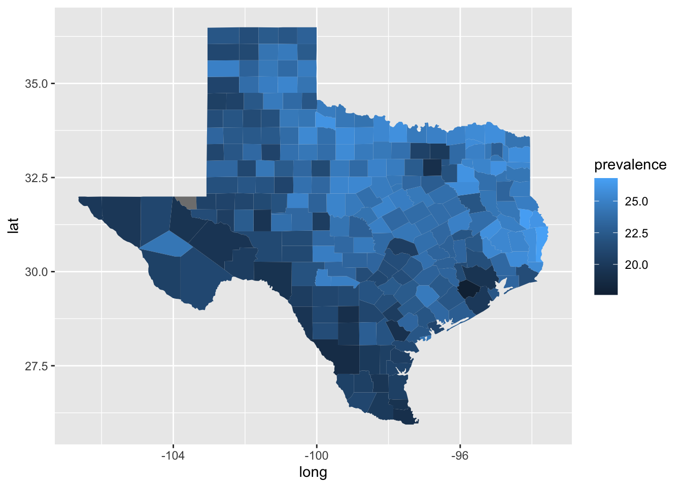
Amazing, we have our map! It looks like counties in the north east of Texas tend to have higher rates of adults with a depressive disorder compared to the counties more south west. It is hard to differentiate the shades of blue though, and there are a few other improvements we should make to the plot. We should:
- use more colorblind friendly colors,
- remove unnecessary axes labels,
- change the legend label,
- add an informative title, and
- specify alternative text for our figure.
In Section 4.1.3 we learned how to specify color-blind friendly colors by defining each color. We can also use a color-palettes readily available. The {viridis} package provides colorblind friendly color palettes. We can use the scale_fill_viridis() function as an additional plot layer to use one of their color pallets.
ggplot(
  depression_map_data,
  aes(x = long, y = lat, group = location_name, fill = prevalence)
) +
  geom_polygon() +
  viridis::scale_fill_viridis()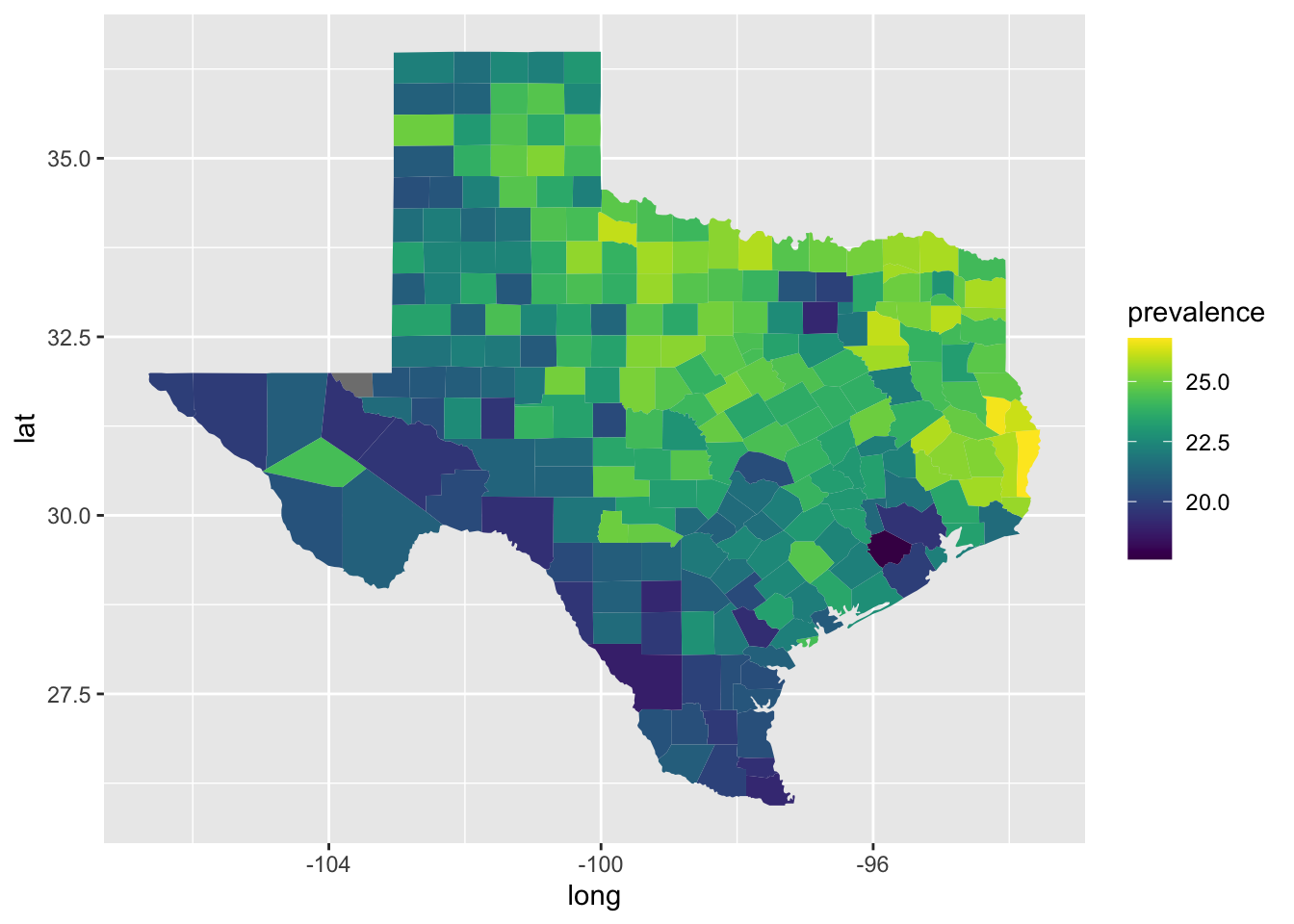
The longitude and latitude axes labels are unnecessary for this map, so we can choose a theme to remove them as well as the gray background.
ggplot(
  depression_map_data,
  aes(x = long, y = lat, group = location_name, fill = prevalence)
) +
  geom_polygon() +
  viridis::scale_fill_viridis() +
  theme_void()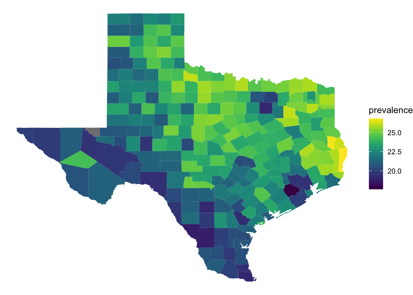
We have already learned how to include titles, labels, and alternative text for ggplots using the labs() function. Writing alternative text can be challenging at sometimes and we can possibly delegate to Generative AI tools to help us generate initial alt text for figures. You always need to check the suggested alt text to make sure it conveys what you think it should to someone relying on a screen reader.
ggplot(
  depression_map_data,
  aes(x = long, y = lat, group = location_name, fill = prevalence)
) +
  geom_polygon() +
  viridis::scale_fill_viridis() +
  theme_void() +
  labs(
    fill = "% of Adults\nWith Depression",
    title = "Prevalence of Depression Among Adults by Texas County in 2023",
    alt = "A map of Texas showing county-level depression prevalence estimates for 2023. Counties are shaded along a color gradient from a minimum observed prevalence around 18% to a max observed prevalence around 27%. Northeastern counties generally have higher depression prevalence."
  )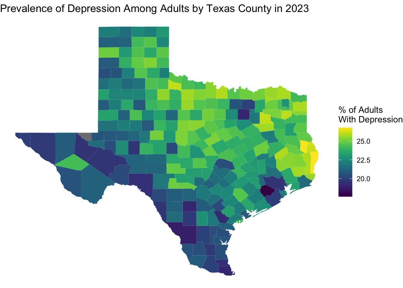
Next, we can look at the numbers in more detail. For example, we can identify which counties have the lowest and highest estimates prevalence of depression.
min_count_prev <-
  texas_depression |>
  filter(prevalence == min(prevalence, na.rm = TRUE)) |>
  pull(location_name)

max_count_prev <-
  texas_depression |>
  filter(prevalence == max(prevalence, na.rm = TRUE)) |>
pull(location_name)min_count_prev[1] "Fort Bend"max_count_prev[1] "Newton"It is interesting that some counties do not follow the general trend of increased prevalence for more northeastern counties. Maybe this is related to the population size of the county. We can make a plot to visualize the relationship between depression prevalence and population to investigate this.
ggplot(texas_depression, aes(x = total_pop18plus, y = prevalence)) +
  geom_point()
Warning: Removed 1 row containing missing values or values outside the scale range
(`geom_point()`).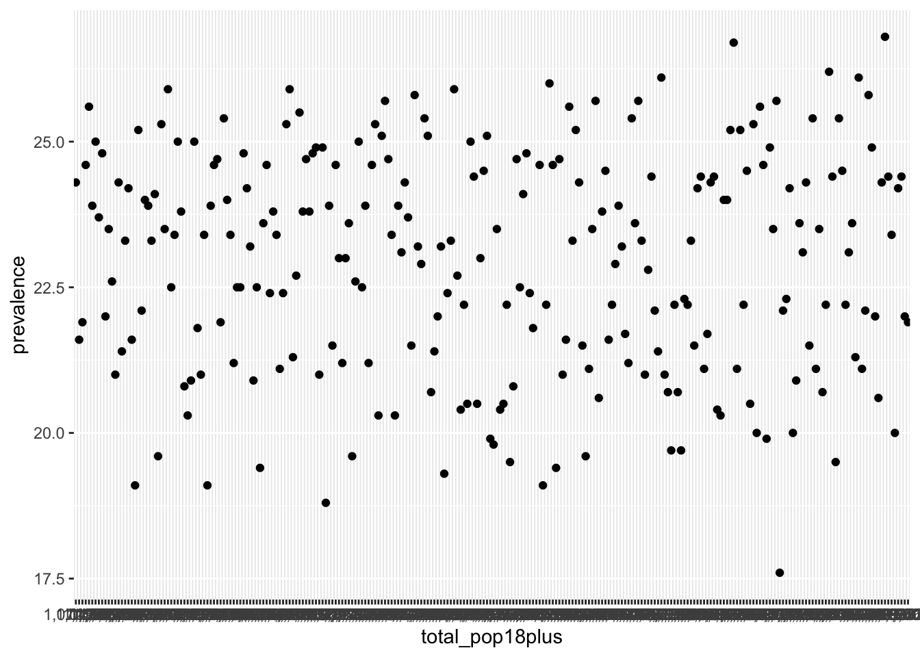
Population did not display correctly because it is currently stored as a character variable since there are commas in the values. Since we want to remove all of the commas from a string, we can use the str_remove_all() function and then convert the column to a numeric.
texas_depression <-
  texas_depression |>
  mutate(
    total_pop18plus = str_remove_all(total_pop18plus, ","),
    total_pop18plus = as.numeric(total_pop18plus)
  )

ggplot(texas_depression, aes(x = total_pop18plus, y = prevalence)) +
  geom_point()
Warning: Removed 1 row containing missing values or values outside the scale range
(`geom_point()`).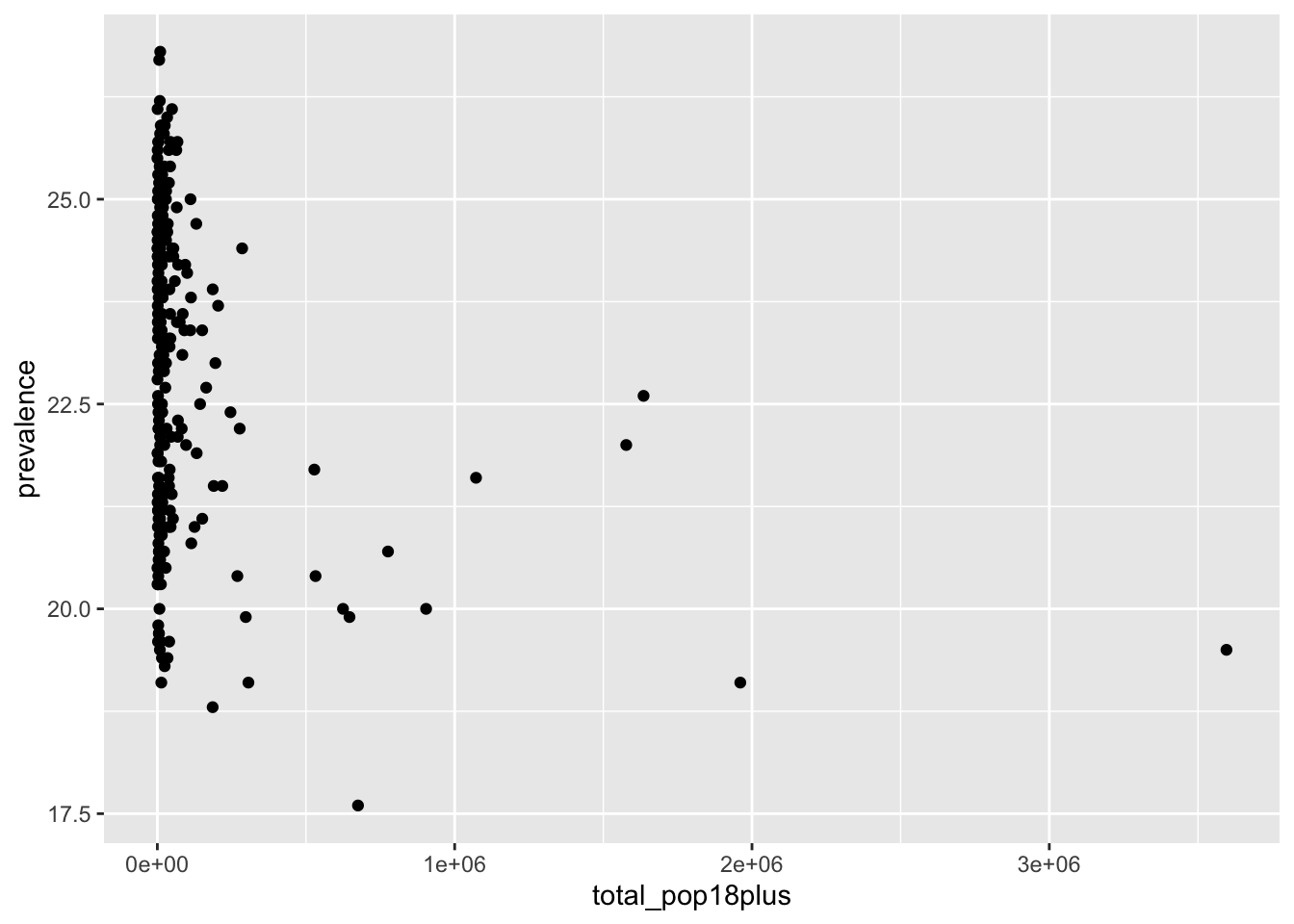
There is not much of a pattern to see here, other than that the counties with the largest populations have below average levels of depression. Instead of including this plot in our final analysis, let’s make a table for the 10 counties with the highest estimated depression prevalence. In our table we can include county name, population, and estimated prevalence of depression. In Chapter 8 you learned how to make nice tables. We will use those skills here to make our table more presentable.
library(gt)
library(gtExtras)

top_depression_table <-
  texas_depression |>
  arrange(desc(prevalence)) |>
  slice(1:10) |>
  select(
    location_name,
    total_pop18plus,
    prevalence
  ) |>
  gt() |>
  fmt_number(columns = total_pop18plus, decimals = 0) |>
  gt_plt_bar_pct(column = prevalence, scaled = TRUE, labels = TRUE) |>
  cols_label(
    location_name = "County",
    total_pop18plus = "Adult population",
    prevalence = "Estimated prevalence of depression (%)"
  )
top_depression_table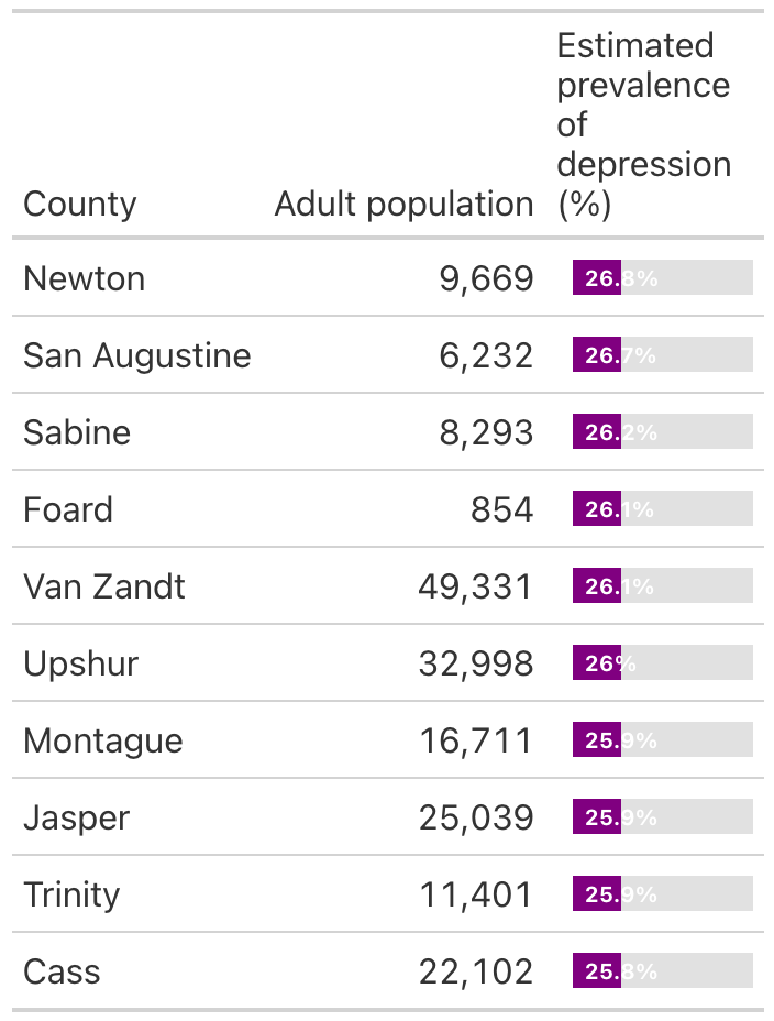
As determined previously, we knew that Newton County has the highest depression prevalence, but now we know the specific value is 26.8%. We can also see that the other top 9 counties have similarly high prevalence as well.
9.5 Improving Plots
Notice that we took the time to improve our plot and table that we wanted to use in our final report for our EDA. There are some improvements that were already covered in previous chapters, like alternative text, and some that arise very particular to a situation, like the theme_void() for maps. In the following subsections we will present 3 recommendations for improving commonly used plots, followed by an example of a basic plot and an improved plot.
9.5.1 Improving a Bar Plot
Recommendations:
Reorder categories by value: Sort bars from highest to lowest (or lowest to highest) so readers immediately see patterns or according to ordering of ordinal variable. Default alphabetical ordering hides the story. The
reorder()function can be useful for this.Flip axis with labels: If the bar labels are not legible, swap the variable from the x to the y axis.
Use direct labels instead of a legend: If possible, put values or category labels directly on or next to the bars to reduce eye travel.
Example: Summarizing population size for Texas Counties
Following is a basic bar plot created by categorizing counties based on population size.
texas_depression <-
  texas_depression |>
  mutate(county_size = case_when(
    total_pop18plus < 1000 ~ "Extremely small",
    total_pop18plus < 5000 ~ "Small",
    total_pop18plus < 50000 ~ "Medium",
    total_pop18plus < 100000 ~ "Large",
    total_pop18plus >= 100000 ~ "Extremely large"
  ))

ggplot(texas_depression, aes(x = county_size)) +
  geom_bar()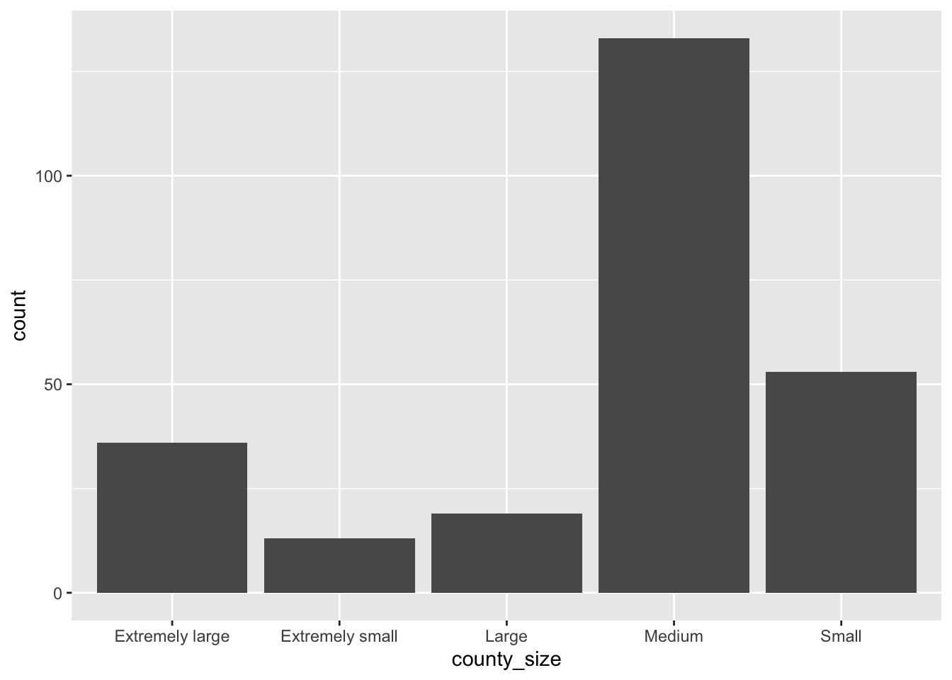
Let’s go ahead and add improvements to out basic bar plot.
texas_depression <-
  texas_depression |>
1  mutate(
    county_size = factor(
      county_size,
      levels = c(
        "Extremely small",
        "Small",
        "Medium",
        "Large",
        "Extremely large"
      )
    )
  )

2ggplot(texas_depression, aes(y = county_size)) +
  geom_bar(fill = "#009E73") +
3  geom_text(
    stat = "count",
    aes(label = after_stat(count)),
    hjust = 1.5
  ) +
  labs(
    x = "Count",
    y = "County size by adult population",
    alt = "Horizontal bar plot showing number of counties of each size. There are 13 counties deemed 'extremely small', 53 'small', 133 'medium', 19 'large', and 36 'extremely large' counties."
  ) +
theme_classic()- 1
- Ordered according to natural ordering of ordinal variable.
- 2
- Swapped county size variable to y-axis.
- 3
- Added direct labels of counts.
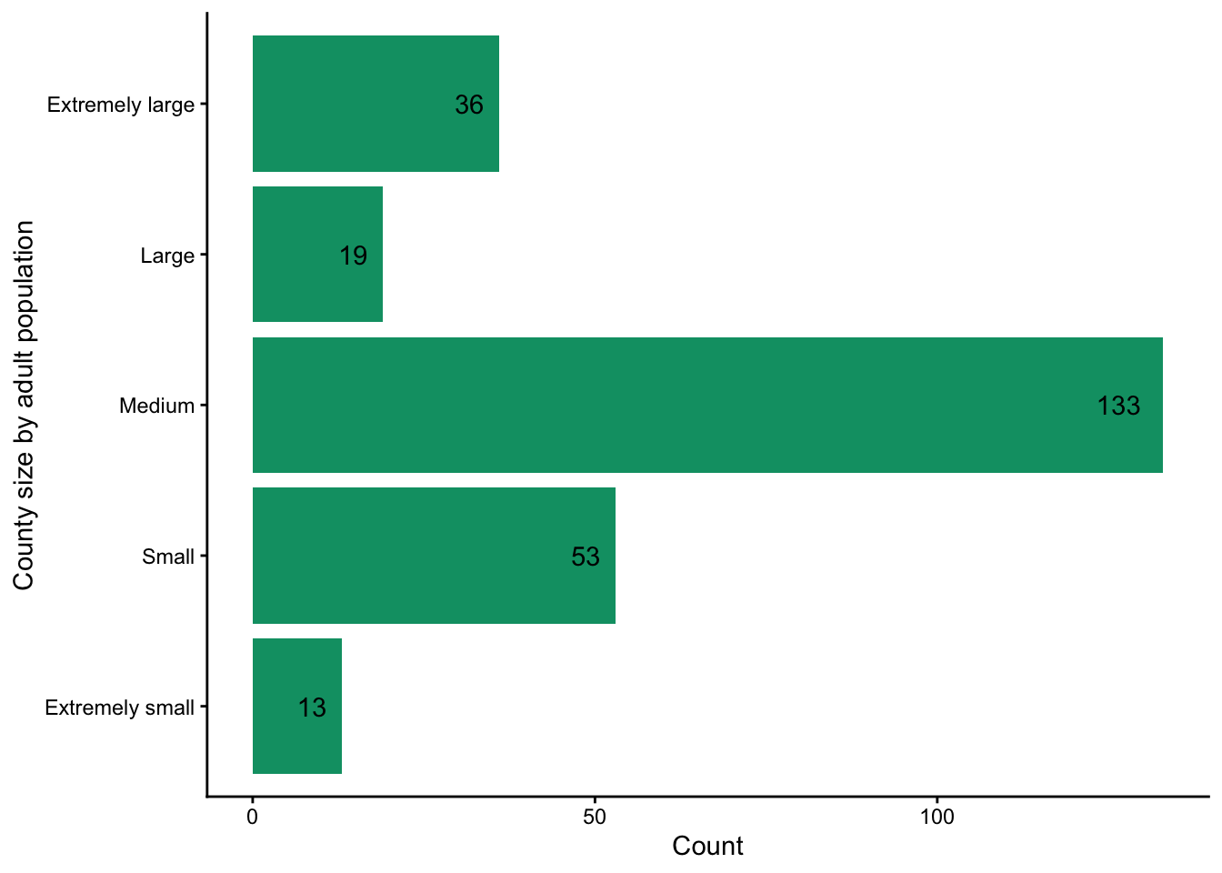
Out bar plot now clearly shows, with values displayed, that most counties fall into the medium size category, with much smaller counts in the other groups.
9.5.2 Improving a Histogram
Recommendations:
Choose meaningful bin widths: Default binning often misleads. Adjust binwidth or bins to show the underlying distribution more clearly.
Highlight distribution shape: Consider overlaying a density curve for clarity. A density curve is a smooth, continuous line that shows how a total crowd of data is spread out, where the high peaks represent where most values are clustered and the low flat areas show what is rare.
Emphasize context: Consider adding vertical reference lines (e.g., mean, median, policy cutoff) with annotations to guide interpretation.
Example: Distribution of depression prevalence.
Let’s look at the distribution of the percent of adults in Texas with depression.
ggplot(texas_depression, aes(x = prevalence)) +
  geom_histogram()
`stat_bin()` using `bins = 30`. Pick better value `binwidth`.Warning: Removed 1 row containing non-finite outside the scale range
(`stat_bin()`).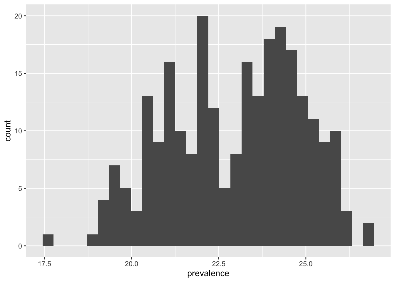
Next, we can add improvements to our basic histogram as suggested above.
my_binwidth <- 0.25
median_depression <- median(texas_depression$prevalence, na.rm = TRUE)
mean_depression <- mean(texas_depression$prevalence, na.rm = TRUE)
sd_depression <- sd(texas_depression$prevalence, na.rm = TRUE)

ggplot(texas_depression, aes(x = prevalence)) +
  geom_histogram(
1    binwidth = my_binwidth,
    fill = "#009E73",
    color = "white"
    ) +
2  geom_density(aes(y = after_stat(count) * my_binwidth)) +
3  annotate(
    "text",
    x = 18.5,
    y = 17,
    label = paste("Median:", round(median_depression, 2))
  ) +
  annotate(
    "text",
    x = 18.5,
    y = 15,
    label = paste("Mean:", round(mean_depression, 2))
  ) +
  annotate(
    "text",
    x = 18.5,
    y = 13,
    label = paste("SD:", round(sd_depression, 2))
  ) +
  labs(
    x = "Percent of adults in county with depression",
    y = "Count",
    title = "Depression prevalence for Texas counties in 2023",
    alt = "Histogram of depression prevalence which ranges approximately from 17.5% to 27%. The distribution appears to be slightly bimodal with peaks around 21% and 24%."
  ) +
theme_classic()- 1
- Chose meaningful bin widths of 0.25.
- 2
- Highlighted shape of distribution by overlaying smoothed curve.
- 3
- Added annotations to plot.
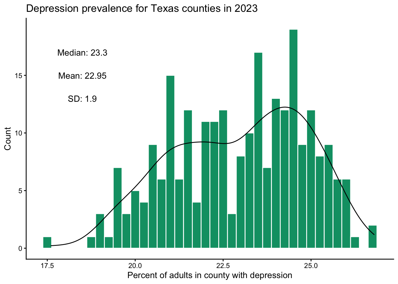
The distribution appears to be slightly bimodal with peaks around 21% and 24%.
And lastly, we talk about suggestions to create a scatterplot beyond the basic one.
9.5.3 Improving a Scatterplot
Recommendations:
Change default tick labels: The x and y axes sometimes display numbers in a less intuitive way. A common example of this is when the values plotted on an axis are large, R will display them in scientific notation. Recall for scientific notation a number is represented typically as \(\text{Number} \times 10^{\text{Power}}\), where the power is the number of decimal places moved. For example \(120,400 = 1.204 \times 10^{5}\) and \(0.01204 = 1.204 \times 10^{-2}\) would show in R as \(1.204e+05\) and \(1.204e-02\).
Address overlapping points: Use transparency (alpha) to avoid hiding dense regions.
Explore transformations to illuminate relationships When a variable has some extreme values it can make it hard to see the relationship between two variables for the majority of the data. In such cases is can be helpful to transform the variable with the extreme values using a transformation that will maintain the direction of the relationship. Two common functions used for this are the log and square root functions.
Example: Depression prevalence by population.
Let’s revisit the scatterplot we created in the previous section showing the relationship between depression prevalence and county adult population. We will first discuss
ggplot(texas_depression, aes(x = total_pop18plus, y = prevalence)) +
  geom_point()
Warning: Removed 1 row containing missing values or values outside the scale range
(`geom_point()`).
Now let’s add some improvements
ggplot(texas_depression, aes(x = total_pop18plus, y = prevalence)) +
1  geom_point(alpha = 0.25) +
2  scale_x_continuous(labels = scales::label_number()) +
  labs(
    x = "Total adult population",
    y = "Percent of adults in county \n with depression",
    alt = "Scatterplot of depression prevalence, ranging approximately from 17.5% to 27%, by adult population size, ranging from near 0 to around 3.5 million. Most counties have small population size with large range of prevalence."
  ) +
theme_minimal()- 1
- Increased transparency of points.
- 2
- Told x-axis tick labels to not be in scientific notation.
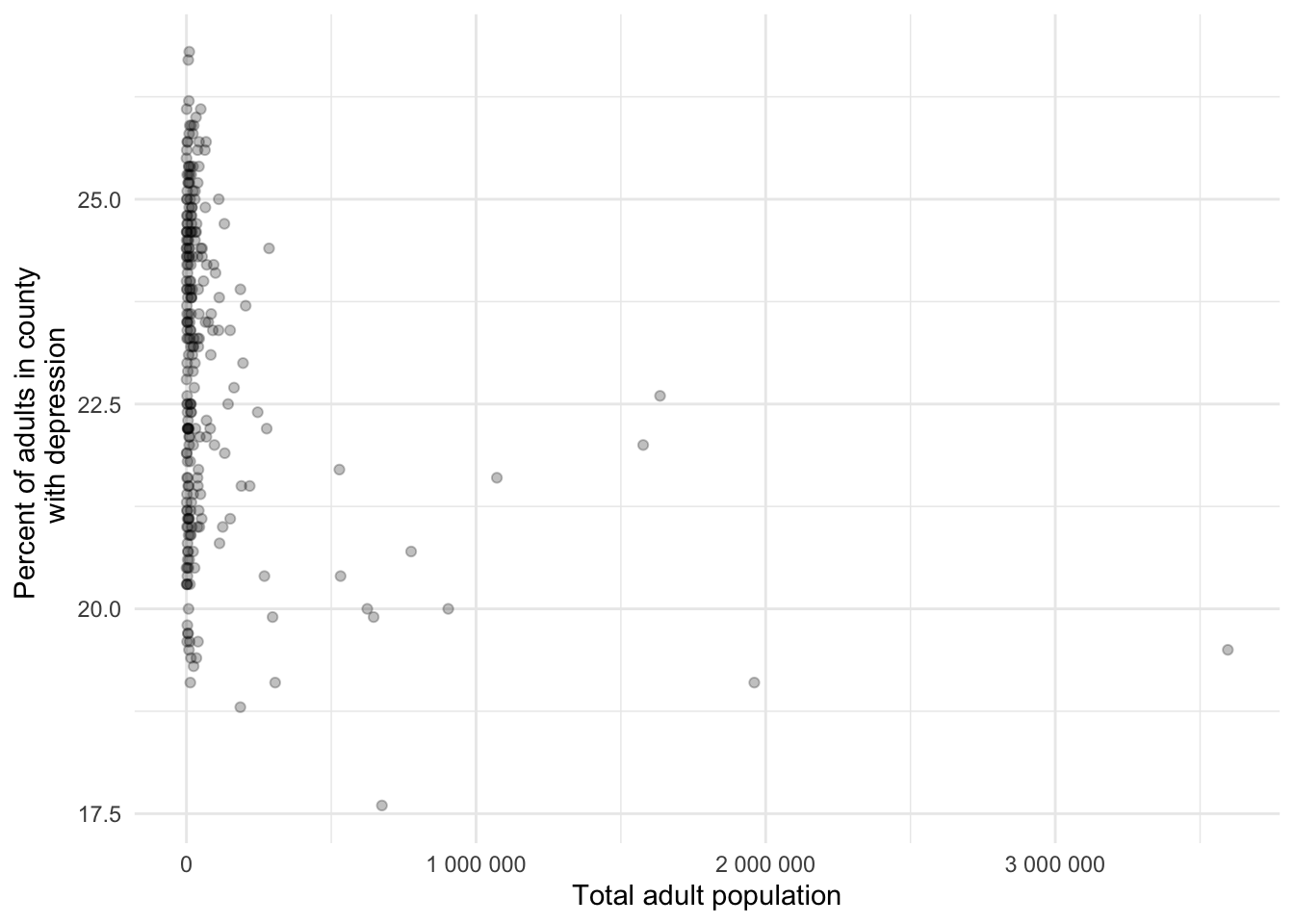
Depression prevalence and population size do not appear to be related for counties with a large population. That said, the counties with extremely large population have relatively lower depression prevalence estimates.
Now let’s consider a transformation of the population variable
texas_depression |>
1  mutate(log_total_pop18plus = log(total_pop18plus)) |>
2  mutate(total_pop18plus_over_1mil = total_pop18plus > 1000000) |>
  ggplot(aes(x = log_total_pop18plus, y = prevalence, color = total_pop18plus_over_1mil)) +
  geom_point() +
  labs(
    x = "Total adult population (log scale)",
    y = "Percent of adults in county \n with depression",
    color = "Adult population > 1,000,000",
    alt = "Scatterplot of depression prevalence, ranging approximately from 17.5% to 27%, by log adult population size, ranging from near 6 to 15. There is a slight overall downward trend."
  ) +
theme_minimal()- 1
-
A new variable was created
log_total_pop18pluswhich is the natural log oftotal_pop18plus. Note that in statistics the natural log, often written “ln”, is the most commonly used, so in Rlog(x)= \(log_e(x)\). - 2
- A new variable was created to note which counties had adult populations over 1 million people.
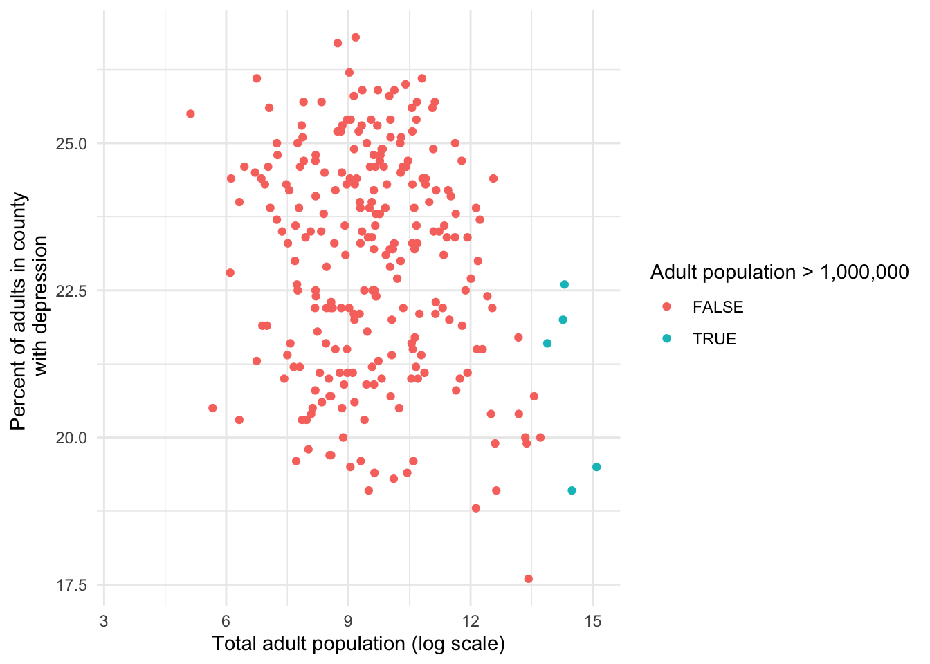
By transforming the variable we are able to explore the relationship between depression prevalence versus adult population size for counties of all sizes, whereas in the non transformed plot we were mostly only able to see large counties distinctly. We colored the five counties with populations over 1 million people for demonstrative purposes here. The coloring highlights that the log transformation preserved the ordering of the values for the variable, meaning that the counties with the largest population have the largest log population.
From this plot we can see that there is an overall weak negative, relationship between depression prevalence and adult population. When presenting these findings consider including both improved scatterplots, the transformed and untransformed scatterplots, because there is valuable information in both. In later chapters, making meaning of transformed data will make much more sense.
There is an entire realm that opens up when we start thinking deeply about the relationship between variables. This book is meant to be an introduction to data science, so we will discuss some of these methods in later chapters, and hope to inspire your curiosity to delve further into the field!
We see two issues: capitalization inconsistency and mismatch of column names.↩︎